Painting with Paulson
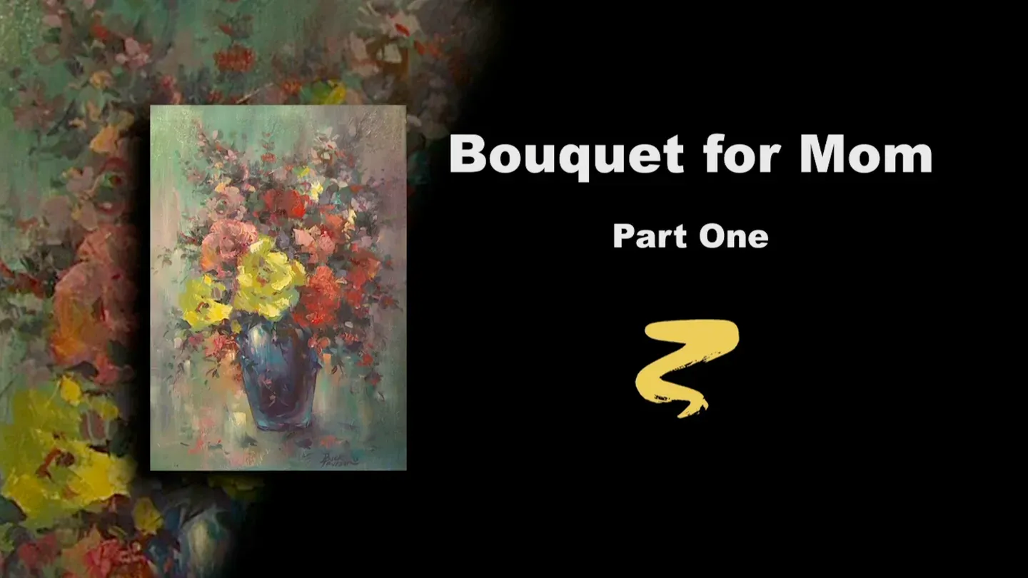
Bouquet for Mom Part I
3/1/2025 | 26m 46sVideo has Closed Captions
Buck paints stage one of Bouquet for Mom.
In the Series 8 opener, master artist Buck Paulson paints a beautiful bouquet of flowers for someone special.
Problems with Closed Captions? Closed Captioning Feedback
Problems with Closed Captions? Closed Captioning Feedback
Painting with Paulson is a local public television program presented by Prairie Public
Painting with Paulson
Bouquet for Mom Part I
3/1/2025 | 26m 46sVideo has Closed Captions
In the Series 8 opener, master artist Buck Paulson paints a beautiful bouquet of flowers for someone special.
Problems with Closed Captions? Closed Captioning Feedback
How to Watch Painting with Paulson
Painting with Paulson is available to stream on pbs.org and the free PBS App, available on iPhone, Apple TV, Android TV, Android smartphones, Amazon Fire TV, Amazon Fire Tablet, Roku, Samsung Smart TV, and Vizio.
Providing Support for PBS.org
Learn Moreabout PBS online sponsorshipWhile these seeds are very small and very few in number, you stay tuned and watch them grow!
[piano plays in bright rhythm & tone] ♪ ♪ ♪ ♪ Let me show you how we prepared the canvas for today's part 1, part 1-- acrylic stage.
You have the line drawing, which will be a great help for you.
Now this is primed with 1 Turquoise Blue, 1 Cadmium Yellow, 1 black, then you double that with white, so that's 3 white.
This is put on very smoothly, and then you let it dry.
And after you've let it dry, you come with your drawing.
Now the drawing, often what I will do, and it's such an advantage when you have a primed canvas, is to take a piece of chalk, and you put on, and it's very easy to see, that's why it's nice to have the primed canvas.
That's one reason.
The other reason for having a primed canvas is that those colors play through the other colors to give real quality to your finished painting.
A variety of colors and quality, very similar.
Ok, after I've put on the drawing with the chalk, and then I'll either change it with a pencil or go ahead and put the acrylics on.
Here I've outlined all of my drawing with Ultramarine Blue acrylics.
So we have the flowers and we have the vase.
And your going to have a little bit of a happening in the background.
Kind of, it enhances the painting.
This is a "Painting for Mom."
I think I said, "Bouquet for Mom."
Does that give it a little more quality?
Anyway, down to the palette; we're using acrylics.
I have Alizarin Crimson and I have Turquoise Blue.
I would call that equal parts, there may be just a little bit more Alizarin, but we'll call it equal parts, then I'll add just a little white.
And once I get this mixed, let's see how much white we put in.
This would be about half a part, compared with the blue and the Alizarin.
It makes it just a little less dark.
Ok, that's ready to be put on.
You notice when I do this, when I've mixed this up, I'm not overly disciplined to say, "oh, you have to have just perfectly, it's got to be all mixed."
There's a little variation in there-- variegated.
And I like that because it gives you a little serendipity and colors in your painting.
Ok, I have a fan brush and I've wet it quite a lot, and I'm going to put this on, by doing, cutting in-between the flowers or the circles that are there.
And when you are doing this, you don't have to worry about the circles being just perfectly round.
You might cut into them a little bit.
When you put on the next color, then you can expand them a little bit.
Now we'll just go down through.
This is like a maze, you're trying to find your way through it.
We'll put this in solidly first, then talk about the next things.
I'm just running down, picking up more paint.
I did not have to go back to the water this time.
The first time the water kind of softened it all up a little bit.
Oh, it's so good to be back with you today, I just love it!
If you check some old PBS shows, you'll find it says, "Buck, in 1988."
Well, you'll find that's 20 years on the circuit.
Ah, and it's just as exciting today.
It's probably more exciting, because the longer you paint, the more facility you gain.
And you feel-- I'm dipping for a little more water-- you feel, I can be more of a help to the students.
whether they're in my classes or whether they're sitting in the rocking chair.
See some of you guys, you might've gotten older too.
See, you're in a rocking chair.
I'm still standing!
That gives me what I want to place, just in a general way in-between the flowers.
Kind of holds them together a little bit.
Then I'll go out on these little stems, and I have a small amount of paint.
Actually if a, oh there's one of the seeds that got away, um, love those seeds, you're gonna grow!
Ok, here's what we do as we go out on the little stems.
Just kind of wiggle.
You're not thinking, oh, I need to have a leaf, it needs to look just like a leaf.
No, you're just putting kind of a background in.
You'll find as you do these, the ones I'm showing you, yours might be a little different.
You might make it a little different on purpose, or you might accidentally make it a little different.
So what I've done is kind of opened up the road for me too.
I can do something a little different than what I'm first looking at.
I love that aspect, that you're not so tied to something, you think, oh that stroke, it should have gone this way!
Big deal.
So what's the difference?
It's going to be absolutely gorgeous.
Come out a little bit there.
I try to have not to much thickness of paint at this time, although there's no problem with that.
Sometimes with this, where we're going to be using a lot of palette knife, some of those textures just fit right in.
Ok, coming out to the left here.
Don't you like it, the way the cameras are today?
You're going to be able to see my hand, unless I start painting left-handed.
Oh, I started painting left handed and you can't see it.
So I'll stay right-handed so you can see it.
Just as if you can paint left-handed.
Well, there was one time when I had a little-- I don't know what the deal was with the arm, I had to paint some left-handed paintings, I thought, gee, that's kind of interesting.
It's sure different.
And you have to do a little bit of thinking on which way you are going to go, but it does work.
A little bit down here.
Ok, that puts on the darks on the side between the flowers and on the leaves.
Now, I'll take some of the same color, and we're going to put this on the vase, then we'll put some around on the background a little bit.
It's very helpful for me, and I'm sure it's helpful for you, we have the picture right there.
And then next week, what we'll do is, we'll go to a finished painting.
We'll have a finished painting over there, and we'll have the in-between stage here.
So I think you are going to gain much from these shows.
The high definition?
Wow!
Then having the model right close by.
So it's always important to hear from you, and I hear from so many of you.
Did you know I received a letter from, or email from a fan in Ghana?
That's West Africa isn't it?
Ghana?
And he wanted a DVD, and I sent it to him.
He said, "I want to see those pochades, Buck."
So we sent it to him.
It's so neat to correspond with people across the country, in Canada.
I've got a lot of fans up in Canada.
Why I used to live there for 3 years, teaching and coaching with my wife.
Ah, it was so neat.
Love those Canadians.
There's only one Canadian I didn't like.
That's when I was playing baseball and the guy in stand says, "hey, draft dodger!"
I'd been in the army, but I couldn't say anything!
So I hit that ball a mile.
That showed him.
The guy out there caught it, but boy...no, I love that guy too.
Ok, now you can see on the vase what I did.
I put the color on and kind of saved a bit of an opening.
I'll come back with some water on a paper towel, and just wipe in here a little bit.
What I plan on doing is a little more of a gradation.
So as I wipe that, you're retaining that inside edge, but you're spreading the shoulders out a little further.
Ooh, beautiful.
I like that!
Ah!
I like that!
Ok, you like that, Buck.
Now we'll some same blue, if you sort of pick up a couple of places, one like this.
This helps where you kind of almost frame your subject.
That is so helpful.
You don't necessarily want the audience to say, oh, I see what he's trying to get me to do.
That's not it at all.
But you do it just so they enjoy it and feel good without knowing your method of operation.
Now, here again, after I put this one on, I'll take just a little moist paper towel and kind of push that around.
It just softens, it's such a nice way to do.
That soft, not too wet, or you'll take too much off.
Then we, as I look at the picture, the painting, I see just a little shadow in here.
I'm wondering why that is.
Because with the light coming from here, you need to make sure your shadow is going out there.
It must be just a little bit of some of this shading down below.
Regardless of reason, we're using it.
Then over on this side, I noticed just a little bit softness too.
And you, um, maybe can't see it right now, but when I'm putting this on, I use much less paint.
And initially, you'll think, well it looks pretty wet.
Pretty much the same.
But it's lighter than what's in the leaves.
Just a little bit up there.
Ok, I think that'll be enough.
Let's just again, just wipe those gently... in here particularly.
Now, we're going to go ahead and put on some flowers.
When I do this, I used to do it where I would take and just fill in the circle.
Just a solid filling in.
But now I've chosen, even though it's not much different, I'll have just a little character in that first application.
In this case I'm going to use the Alizarin Crimson and white.
Let's see... Ok. Alizarin Crimson is right here.
You must have been out a couple of seconds or you've been out sunning, because you're just a little dry.
Now remember what I said.
When I come up here, rather than filling the whole thing in, I'll kind of start on the edges, and I'm not tied-- I'm not tied to the circle that I put in.
That's location, but it certainly isn't, it isn't, what do one of those monitors say?
"Turn left, next, straight 75 feet."
We're not doing that exact.
We're in the general area.
You'll also notice as we do this that there is a little bit of that, it'll look quite wet, but it will dry just a little bit too.
And then we have one out here.
Now notice this one.
Just a small little circle, and I want to make it larger.
Ah, there's so much beauty in that.
And even in putting this on, there's certain little amounts that some places there's less, then a little bit more.
Let's go ahead and stay with that red as we go around.
I think I better squeeze out just a little bit more Alizarin Crimson.
Oo, I love these paints.
Ah, they respond, a little water, because we are doing that, just kind of casual littleness.
Ok, I have a pink flower there, so I'll go past him.
But his neighbors are small little red ones.
Come out on this little twig.
Then we have a large one here.
When I say large one, see, you're looking and say, well, there's no room for a large one.
But I'm saying, yes, there is.
Let's move it out.
I would suppose, if you're talking about composition, that your larger ones are going to be generally down here, closer to the center of interest, and then your eye will stay there.
Your eye will stay there, because you have the nice contrast-- the yellow and the red.
And then you also will have the detail of the vase.
So these that are out further are just a little smaller, out in the suburbs.
And when I come to the twigs, which I just did, I'll kind of dance around.
So it isn't just saying, well I need to be right in the middle of it.
See, the middle is right here, or that's were the twig is.
So some of them a little bit on the left side, little bit on the right, maybe right on it.
And then just a little bit right along there without saying, did I hit it correctly or not?
Ok, a few little small ones over here.
And then let's see, we have a couple of smaller ones down on the left.
My mom loves flowers.
I did another flower painting for her, and she just absolutely loved it.
She was at one of these PBS shows up here, and we had a demonstration for the public.
At that time, afterwards we would draw names and they would win the prize.
And I was drawing the names, and I drew out, and it was Alice Graham.
See, that's my stepfather, my father died, my stepfather.
Graham!
I said, "Oh no, no ,no.
She can't win!"
She's never let me forget that.
So I had to deliver another painting to her.
She's such a good sport, such a great lady, and raised such fine kids!
Let's come a little lower here.
This is right close there.
I don't say it's necessary you put all the same color in first.
You might go ahead and put the yellow on and get sort of a feeling, what you want.
But as long as I'm making a copy of that, it's a little easier to say, ok, let's put all the reds on.
Then you don't have to change the color on the brush that often.
I like that already.
Don't you?
What's nice is the soft blue, that little darker gray: slightish blue, and then that Alizarin.
Really compatible.
There's once in a while you have a painting, that at every stage it looks good.
Every stage!
But it isn't always that way.
I remember-- let me put some yellow on.
I'm going to come in here.
I'm going to use Yellow Ochre, equal parts of Cad Yellow.
Now I can tell my story as I put this on.
I remember once, painting a portrait of a sculptress.
So I would paint her portrait for an hour, then she'd sculpt my head for an hour.
And she did by the adding on, rather than cutting away from a block.
What amazed me-- see, right away, first day, I'm trying to get a likeness.
Trying to get a likeness in the drawing and all that.
She, on her third setting, she says, "Oh, it looks a little bit like you."
Isn't that something?
So even on this, I don't get too panicky on, it has to look just like that.
Here again, as a put on the yellow, this is almost a little brighter than that-- maybe you should have a little brighter yellow; it would help you.
Isn't that neat, when you make the model look better?
So I'm putting this on, as we suggested before, without being solid.
And what's particularly pleasing about this, again, and you can see it on this one, is were that little blue shows through.
Therefore it isn't solid.
And that's very pretty.
Now we have another yellow one down to the left.
I might make that just a little more watery.
Not as much paint.
But still the broken thing.
And here's such a fun thing-- when you're touching the yellow one, the red ones are still a little wet.
What happens?
Don't you love that little color you get in there?
Oh, yes!
I did it on purpose!
That's the way it was meant to be.
After I've done that, it makes me think, let's put a little bit over there too.
Um!
Ok, there's a couple yellow ones a little higher, then we'll do some pink ones.
This again, Yellow Ochre and yellow, Cad Yellow.
These, let's see.
We got a pink one here, we got a little red there.
So this one looks like it's in here.
This seems to be more of a small flower, rather than a large one like the other ones.
Oh, I love that!
It so much fun to do a new painting.
You say, "but you've already done that one."
But you're allowing yourself to experiment.
Just the fact of it blending into its neighbor was so pleasing there.
I need to put just a little bit more in the middle.
Ok, let's now make a pink.
The pink, I have Quinacridone Rose and white.
Let's see what the proportion is.
This is the white.
The Quinacridone Rose, just on the board, it almost looks like Alizarin Crimson, but it's just a little more pink when you mix it.
Let's try and see if that's true.
That's Quinacridone Rose-- boy there isn't much difference, but I kind of think there's a little bit.
Anyway, were going to use Quinacridone Rose just because I want to impress you, the way I can say those words!
Quinacridone Rose and pink.
No, Quinacridone Rose and white, makes the pink.
Ok, coming up, we have 3, we have 4 of those to do, and then we have some smaller ones.
What I'd like to still do before we finish today would be to put just a little work in the background and a little light on the vase.
So we have to move a little bit here.
I'll just put this on, and I won't refill it, I'll just take and say, ok, we'll put this over like this.
Like that, then you're the other one.
Same thing, if it bangs into the neighbor a little bit, so be it.
And then down here's a little one.
I'll pick up a little more of the paint, the pink.
And we're coming up and just a few little loose ones.
These are a different type, they're not the round ones.
There, and here, and a few down there.
And a few hanging down there.
Ok, what we want to make sure that we get into the picture would be the lights on the vase.
So we'll take a moment and just do that.
Ok, so I'm cleaning the brush.
And let's see what we want to put on there.
Let's just try the Turquoise Blue and white.
This will be very high key, and when I say high key, I mean very close to white.
Ok, you're Turquoise Blue and you're white.
Just a little more blue, a little more blue.
Perfect.
Ok, I'll put this on with the side of the knife-- you're a brush, side of the brush.
You put it on and then just soften a little bit, and we might try that same type of blending with a moist paper towel.
I'm rather large on that light, but I like it, I like what it does.
Ok, we're just about finished on this stage.
I would like to take just a little yellow and the white, and it's got just a touch of the blue too.
So that's yellow and white with a little touch of the blue.
And see, I'm going to come over on the side and just kind of brush in.
This isn't quite as wet.
It's just a little more dry brush, and this will give us some great accents, that will help us when we start putting color on that picture.
I'll wet the brush just a little bit.
Were just about having to say good-bye to you.
I hate to say good-bye, however you're going to come back.
You're going to come back, and I love that aspect.
Ok, this is with a little wetness on the paper towel.
So I'm blending it so it's sharper near the flowers and fades as it goes away.
This one, I'll just brush up.
It'll make less, so the quantity is right there.
That's the impact.
That's the impact place.
[soft thumping] [soft scraping] Ah, this is so much fun!
Ok, what else?
Just a little bit there.
I think we're about ready to say good-bye.
Here again, if I just touch a little pink accidentally, what will that do out in the background?
We've learned together today!
I've learned some things that I'm going to use from now on.
That little extra colors, the neighbors, watch your neighborhood.
Then I'm going to take a paper towel, it's a little wet, and I'll just slightly touch on this last pink that I put on.
What I'm doing, it just softens around a little bit more.
The other thing we could do, it won't take long, would be just to touch a little bit into the middle of the flowers, and we could use the Alizarin Crimson and just a slight little touch there.
That helps-- then you know where they're looking.
So it's been a great day, it's been a great season.
We've grown flowers for you, and I hope you've enjoyed them.
Oof, it's such a joy to do them for you.
Just a little here and there.
You kind of watch the blank spots.
You say, right in here's a blank spot.
So if I add just a little teeny bit of red there.
So that's one thing you watch, so they don't feel isolated.
Just give it a little bit of a neighbor.
It doesn't compete with the size of those, but it works.
Thank you for watching.
You come next time.
It's going to be oils.
It's going to be magic!
You need to be here.
Bye-bye!
♪ ♪ ♪ ♪ ♪ ♪ ♪ ♪ (woman) Funding for "Painting With Paulson" is made possible by...


Support for PBS provided by:
Painting with Paulson is a local public television program presented by Prairie Public