Painting with Paulson
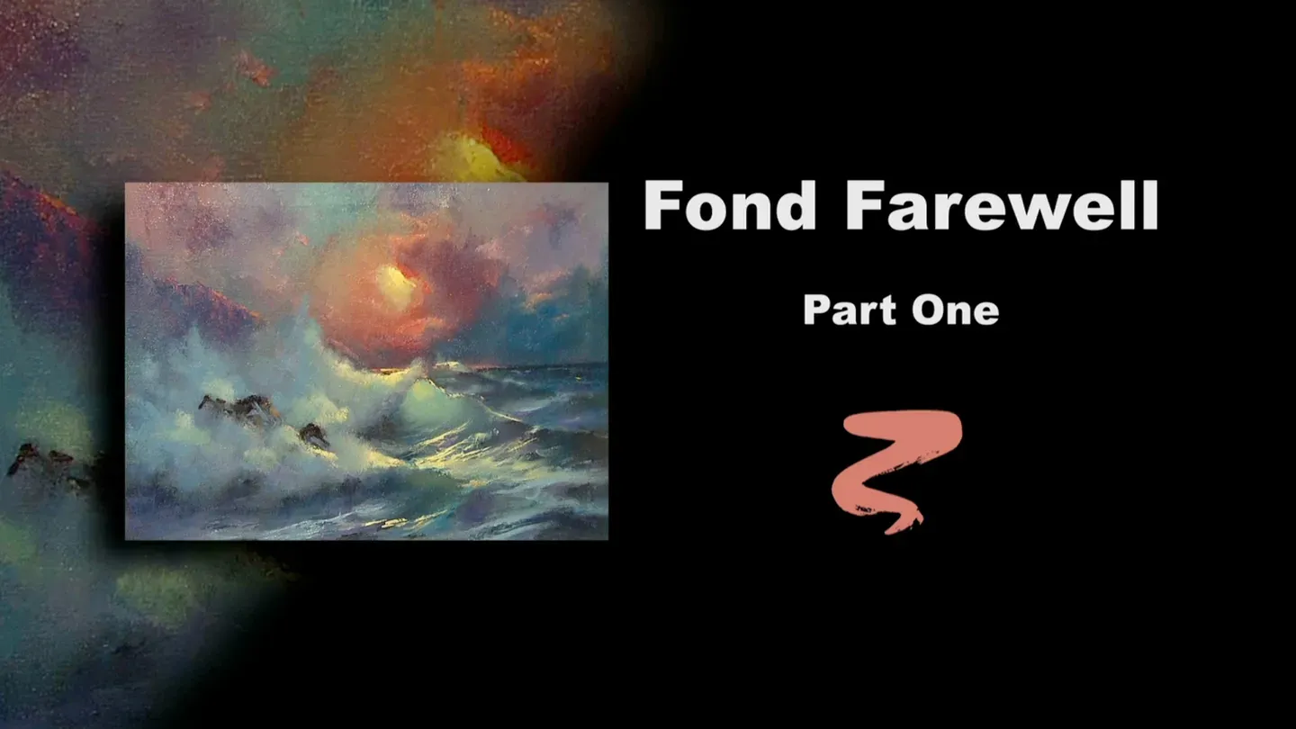
Fond Farewell Part I
3/1/2025 | 26m 46sVideo has Closed Captions
Buck paints stage one of Fond Farewell.
Buck heads to the beach for stage one of Fond Farewell, a seascape with strong waves crashing against the shore.
Problems with Closed Captions? Closed Captioning Feedback
Problems with Closed Captions? Closed Captioning Feedback
Painting with Paulson is a local public television program presented by Prairie Public
Painting with Paulson
Fond Farewell Part I
3/1/2025 | 26m 46sVideo has Closed Captions
Buck heads to the beach for stage one of Fond Farewell, a seascape with strong waves crashing against the shore.
Problems with Closed Captions? Closed Captioning Feedback
How to Watch Painting with Paulson
Painting with Paulson is available to stream on pbs.org and the free PBS App, available on iPhone, Apple TV, Android TV, Android smartphones, Amazon Fire TV, Amazon Fire Tablet, Roku, Samsung Smart TV, and Vizio.
Providing Support for PBS.org
Learn Moreabout PBS online sponsorshipOne day I made a great discovery.
I discovered another way not to paint seascapes.
[piano plays in bright rhythm & tone] ♪ ♪ ♪ ♪ We have something special for you today.
A discovery of another sort.
I am going to do part 1 of part 1!
In other words, we're be doing part 1 of "Fond Farewell," but we're going to have 2 phases in it.
We'll begin with acrylics, do very little.
We'll stop let it dry, and then we'll go on with oils, all in part 1.
So you really stay tuned to this.
I have mixed nothing in advance, so we'll mix right before you.
This is white, and I have Cadmium Yellow and I have Cadmium Orange.
So that looks like about equal parts of orange and yellow, and then about 4 times as much white.
Let's try just a little bit more, so we'll make it... it'll end up being 2 white, 1 orange, 1 yellow.
What I have down here-- stay at the palette-- is a primed little Masonite for a palette, and it's easier to judge the color against it, than if you were on a white palette.
It's truer than when you go from white up to a different color.
Some people go from white to white, so that works too.
Alright, we're placing this on-- oh, the canvas has been primed with Thalo Blue and white.
1 part Thalo Blue, 2 parts white.
That's very nice.
Now when I put this on, I'm not intending anything other than just to put some influence of color on my canvas.
I'm not worried about it being real refined, real soft and all that.
That will come with time.
Let's take and I'll take a little water on a paper towel, and I'll come up to this.
Just to blend it around a little bit, because the blue is dry.
You know what's kind of a nice discovery too?
Is where you find: what happens when you thin out a color on top of another color.
There's almost a little bit of green feeling there, isn't there?
Alright, let's come down to the palette, and now I'll take some Alizarin Crimson and white.
Let's see, you're equal.
Then some Thalo Blue.
So I have put--no you're turquoise blue.
Please get your names right.
Ok, 2 white, 2 Alizarin, and 1 turquoise blue.
So this will give me some very soft colors over in the corner of the sky.
Oh, I the way that water turned, billowing as it first was introduced to my acrylic colors.
Ok, I'm coming over to the corner.
I see I need a little more Alizarin.
I ran down quickly, picked up a little more Alizarin.
So your formula will change.
What will it be?
I think if you have about 4 Alizarin, and 1 turquoise blue, and about 2 white.
Oh, yes, this really gives me a much more powerful color.
Same principle as we did before.
We'll take and just soften.
I don't want too strong a coverage now, because the oil will go on top of this.
Remember, this is all stage 1.
For stage 2, we're going to work on the stage 1.
Boy, that's really brilliant.
We ought to go a long ways with that type of introduction.
I'll take just a little bit more Alizarin into the blue and white.
So this will give me some mountains over here.
Same thing, let's just encourage it to be a little clean hands and fingers and so on.
I'll use that same color down in the water, because I just want to have some semblance of darks down there.
Push it around with a paper towel.
It's amazing how far we can go with this.
It looks kind of wild right at the moment, doesn't it?
But this is all before we put on the oil stage.
I think I'll do one more color, and then we'll stop with the acrylics.
And that will be...I'll take a small flat sable brush, and I have some Paynes Grey and some Quinacridone Rose, equal parts.
And we'll just spot in where the rocks are.
You notice when I do the rocks, I do them very casually, no character at all.
The outer edge might have a little bit, but this is just achieving a place for them to sit.
Alright, let's stop there, and then we'll dry it and we'll come back with oils.
We have finished the acrylic stage, we've dried it, and now a little walnut oil has gone over the whole canvas.
I'm next going to work just a little bit of oil in.
And to start in the sky, I have turquoise blue and white.
I'm going to go very thinly, so it gives me, not a Saturday night bath, per se, but maybe a little bit Saturday night wash-up, just in the sky.
So we're not doing the rest of the canvas.
This almost, brings it back, looking like it did prior to putting any acrylic on.
But it'll make it so it'll be wet, and we have something very soft to work into.
I'm just pushing this around with a dry paper towel, and you can see that the clouds are still in evidence, the place where the sun will be is certainly noted, but the blueish tone that I put over, will take it down a little bit in strength.
Ok, now I'm going to use a little bit of a knife.
I have, this is yellow, let's see this is...
I need to read this, because this is a long one.
Transparent Yellow Iron Oxide and white, and then equal amount of orange.
So the Iron Oxide and the orange are equal.
Now watch how I take that.
I put a quantity on there and I come up to my center of interest area.
And I push sort of hard, right there.
I had quantity, but now watch what happens when I come out on the periphery of it.
See, you don't feel as much, you just have that impact right at the sun area.
[soft scraping] Oh, I love that!
I hope you can hear it-- that's my heartbeat!
It's catching up.
Alright, now I'll go over to the corner of the sky, but I'm going to change and pick up a fan brush.
Here is Quinacridone Violet and white, and its neighbor is just a little purple in it.
So white, and the violet, and a touch of purple.
Isn't that a pretty color?
I'll go right in the corner, because that's quite light.
Sneak over, but see how I leave the blue.
That's almost like the color of the canvas there, isn't it?
And then we'll come over on this side.
A little bit right at the top and then over in here.
This will work as kind of a nice little base, as well, because we'll work some darker colors into that.
I'll come down, just touch against the yellow slightly, to soften it.
And you notice as it softens it, by having the violet, it's not quite as dull.
It's got just a little bit of warmth in the edges.
Let's come down and we'll pick up more of the same thing, but this time there's a little more purple in it.
Dioxazine Purple.
And this will come... it's right here, we'll start here, then you push out towards what is a cloud near the sun.
Wiping the brush with a good paper towel, push this up, push this around.
You're really featuring the center of interest, which is the sky.
"Fond Farewell"-- I'll see you in the morning.
And then you'll be a sunrise.
Is that a sunset?
A sunrise?
That's a sunset, because I say it's so.
You often can't tell the difference.
People would say a sunset, it's a little less clear, because of all the dust and so on.
But if you've had rain, then it's clear again.
Clear in the morning, clear in the evening.
♪ Clear at suppertime.
♪ Let's see, we've got some Cadmium Red Light, and I'm taking this over, just kind of feeling my way a little bit with that.
Touch into that first little pink, and we'll come right up here and put this on.
Oh, very pretty!
And we come down here, put a little bit in too.
And then as I go to the right-- I'm going to clean my brush.
I'm going to use more of the turquoise blue.
This is turquoise blue with just a touch of white.
This will give me a little stronger cloud, over to the right.
Oo, that's beautiful.
A lot of blending.
That is so much the change between a professional and an amateur.
I just stand all amazed, the difference of what blending does.
You put it on and say, "That's great."
And then we'll make it greater.
The bunny brush-- have you ever heard that before?
Buck's bunny brush?
Softly blend.
Oo, that is very pretty.
Now I'll take, just wipe it a little bit, and come over into the sun area, wipe a little, or blend a little bit.
This is a professional look!
Isn't that pretty?
Up in here.
Then we'll leave the sky and we'll come down to the next stage, which is out cliffs.
Cliffs.
I'll take a flat sable brush, no, maybe a little larger.
Also, this is a badger brush, badger flat.
And here I have purple, so I'll take a just little bit of the turquoise blue and put it into that.
That will give me a nice feeling.
It's just a little darker than the clouds.
And notice again, I'm addressing the edges.
Kind of push up, slightly, like that, just a little character.
As I come lower, and that means down by the wave, if you can have-- where it just softens, slightly.
[soft scraping] Then you feel like there's distance between the foam and the cliffs.
There's a little peeking one down in here.
I really like what that does.
It gives a nice accent against the big wave-- eventually, not yet.
Let's use some of this color in the water.
That's not quite dark enough.
Ok, here's purple and the turquoise blue, but now we don't have any white with it.
So this'll give me a good strong dark on the horizon.
This will kind of act as a little bit of a foil with what the light will do, right under the sun.
So I'm coming with a palette knife, and I like building to the lights.
So this is a Quinacridone Violet and white, with just a little bit of red in it.
Come up to the painting, put a little bit of line there, and we'll come across.
I really like that spot, because it's against the water and it's against the cloud.
Let's come with our lightest light that we have in the sun area, and we'll put this on.
This is what I mean by "building to the lights."
This is now just a little lighter.
There's one spot that really works well against that light we just put on and against the wave, and that's having some of this dark paint over here, right there.
Just perfect!
Alright, let's take a fan brush... let's see, where are you?
This one.
You're a little dirty, but we'll use you.
We're going to come with a, let's take some Viridian Green and a little bit of the color that we had in the sky.
That's purple and turquoise blue and a little white.
This will give us a nice wash into the water.
Remember when we put the acrylics on?
We scrubbed in a color, and it wasn't really this color that we want, but having that influence-- when this comes through, you can still feel some of that little-- what kind of color are you?
Kind of maroon color.
Very marooned, if I don't take care of you!
Marooned forever.
Fan brush.
And I did dip in, even though we put oil on the whole canvas, I find once in a while I want it to spread more freely and I'll use additional walnut oil.
The walnut oil, nontoxic.
Use it as a medium, use it as a cleaner!
We're so fortunate to have things that will make us live longer and better and healthier.
I cleaned the corners up a little bit there.
I like, once in a while, I don't see it on this on, but your horizon can be just sometimes be more softened.
Here, because the values aren't that far apart, then you can leave it just a little sharper there.
If this was lighter above, then I'd have to soften that.
Ok, we're coming over there, under there.
Now let's go ahead and put on, just a little bit of color on the foam.
The foam, because of the color of the canvas, we don't have to change it that much.
Let's take, we had earlier, when we put in the sky, we had turquoise blue and white.
I'm thinking we'll try some of the same.
Maybe just a little bit of, let's see, it's Anthraquinone Blue.
You're going to learn some new terms this series.
Anthraquinone Blue The thing I like about the Anthraquinone Blue and white, is that it's more of a grayish, it isn't too bright.
And the way I say that, I almost put them down, but I didn't.
Let's put this on.
This, as you can see, doesn't change it much.
I'm going to use just a little bit more of the blue and white.
This is without the turquoise mixed into it.
Boy, that's a big difference, good thing you went down there and did that, Buck!
We'll put this on, and as I place it on, I really like where it doesn't change the value much, but it has something wet to work into.
So when we put on the highlights in the foam.
I almost hesitated touching those rocks, thinking, they're wet!
But I like to do the rocks last, then I'm not banging around, worried about wether I'm going to hit the rocks or not.
The only rock I worry about hitting is on the baseball field.
Hit that rock!
Down at the edges, theses being the edges, let's do a little different color.
Let's take some purple and white.
I'm just jumping back and forth.
I hope you could follow me there.
Here's the purple.
I want the value to be pretty close to what was just put on.
See, I just touched those together, I can see that.
So this gives me a little color variation, and I'm touching in to the water.
So that it softens the edge.
You want to make sure that these are softened.
Otherwise you feel like, gee, if you sat there, it'd cut your legs.
Let's have a little pink up inside the foam, as well.
So all I'm, doing is adding just a little white to the violet.
I'm going over here, picking up a little bit of the Quinacridone Violet, come back.
Back and forth.
Ok, I think that will give us some of the little--very good.
So of the little beginning of highlights up there.
This is what's very important-- I could put the lights on there, which I will, but if you thin them out, they would turn a little sort of greenish.
But now, by having a little pink in, it'll be a nice thing for the highlights to blend into.
And they won't look greenish.
Same thing, picking up down the palette.
Coming up here, splash up just a little bit, so you have some softness along that edge.
The nice thing about this ocean, this sunset, it's a block-and-a-half away from me.
Now it may have been, that one day I saw the sunset and another day, or maybe even weeks later, I saw the ocean, in that stage.
But to get them both together, you might just have to do a little marriage.
A little online dating!
Right here, we're going to put in a strong color.
For the moment it looks so much alike, you think, what kind of wave is that?
But that strong eye of the wave there will be great.
Again, still putting on the pinkish tone.
Ok, now I'll come with a little bit of color.
I think you'll like this.
This is purple and white, and I'm taking the fan brush.
Watch what I do on this.
I just take and make some kind of rocker strokes.
That gives a nice feeling.
Because you're working in the wet paint, and it makes it feel like it has a sheen to it and some character in there.
Ok, after I've placed that on, then let's go ahead and blend a little bit with our "professional maker," our bunny brush.
I will take and blend a little bit, what I've done on here... and then blend these.
Notice as I blend the water, I blend the same direction that I put those little strokes on with, so I retain the direction.
What are you doing?
I think you are on the next stage.
Oh, I must have made a mistake there someplace with acrylics.
Ok, let's go ahead with-- we'll just cover over him, because that's the great thing about oils and acrylics.
We're going to take some Viridian Green and white.
Here's the Viridian Green and white.
Maybe a touch of yellow.
Yes.
And that will give me the eye, and at the same time we'll cover our little neighbor that came rushing in.
Now I'll put that on like that.
I'll put on where I want another one, and I'll put on where I want a little more light, then I'll blend them.
So I wipe the brush, and I'll zigzag-- very evenly done.
Then blend out the zigzags.
That is such a neat way of doing eyes.
People will often come up and they say, oh, I just love that eye.
It's the easiest thing in the world to do.
Now this one, there's not a lot of room to zigzag, so I'll just kind of flutter it a little bit, like that.
The lower one... there's a little more room.
I don't have to do much, I don't have to have this as large as the other one.
Let's go to the lights on the foam.
And we'll take, this is white, and this is what we had up in the sun area.
The orange and white and the Transparent Yellow Iron Oxide.
See where I'm placing this?
And when I say that, I mean two things: it's on the top of the wave, because the sun's there.
The other thing is, it is on a dry part of the canvas.
Ah, we're just about finished with stage 1.
I'm sort of tapping this down as we do it.
A little bit in here, let's put a little more paint on there.
A little bit in there.
A little bit in here, a little bit in there.
There.
I'll blend those in a minute.
I want to take some of the yellow and white, Cad Yellow and white.
Watch the knife right there.
I can leave that strong, then I'll put a little bit of that same knife work coming down here, and in there.
Rocks-- we need very little touches.
I'll take some of the Quinacridone Rose and a little white, and we'll just cap it on a little bit there.
The sun is just peeking through and hitting that.
A little bit here.
We'll put just a little bit extra light from the orangey color down here, so you can see the edge just a little bit better.
Now, finally, we'll take and blend some of this that we just placed on.
I think what I'll do is go just one little step higher on the lights on the wave, and the easiest way to do that is to go ahead with a knife.
So I'll take the knife, and this is the same thing we had up on the sun.
That's what we had up there, and we'll put just so that peak is a little bit better.
I hope that you've enjoyed stage 1, which has been acrylics and oils on "Fond Farewell."
And we'll see you on the return, as we do stage 2-- refinement.
And you stay and watch that.
You'll love it!
♪ ♪ ♪ ♪ ♪ ♪ ♪ ♪ (woman) Funding for "Painting With Paulson" is made possible by...


Support for PBS provided by:
Painting with Paulson is a local public television program presented by Prairie Public