Painting with Paulson
Fond Farewell Part II
3/1/2025 | 26m 46sVideo has Closed Captions
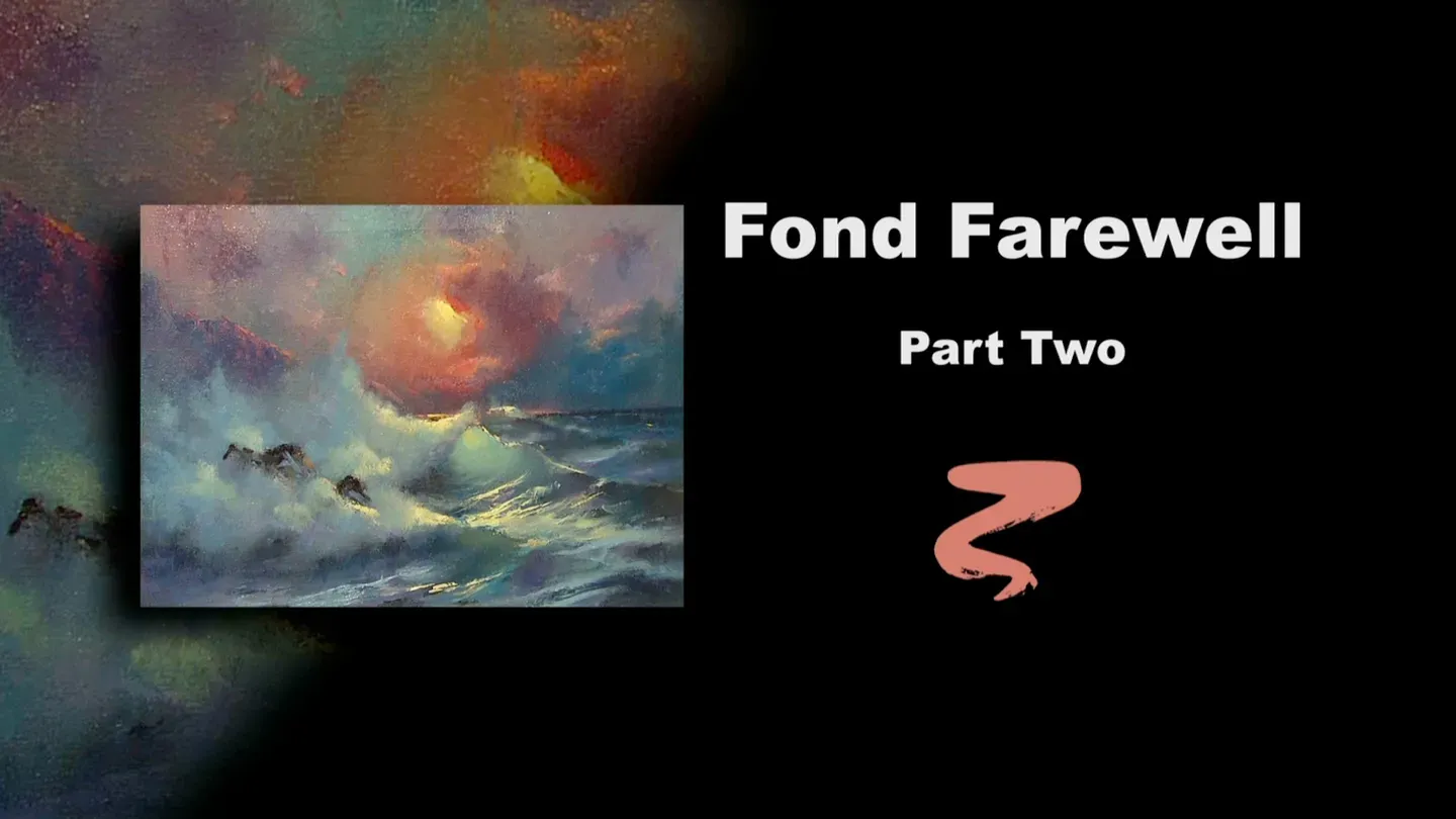
Buck puts the finishing touches on Fond Farewell.
Buck uses oil paint to put the finishing touches on Fond Farewell, adding highlights to the cliffs, water, and sky.
Problems with Closed Captions? Closed Captioning Feedback
Problems with Closed Captions? Closed Captioning Feedback
Painting with Paulson is a local public television program presented by Prairie Public
Painting with Paulson
Fond Farewell Part II
3/1/2025 | 26m 46sVideo has Closed Captions
Buck uses oil paint to put the finishing touches on Fond Farewell, adding highlights to the cliffs, water, and sky.
Problems with Closed Captions? Closed Captioning Feedback
How to Watch Painting with Paulson
Painting with Paulson is available to stream on pbs.org and the free PBS App, available on iPhone, Apple TV, Android TV, Android smartphones, Amazon Fire TV, Amazon Fire Tablet, Roku, Samsung Smart TV, and Vizio.
Providing Support for PBS.org
Learn Moreabout PBS online sponsorshipIt's important to know your competition!
But your only competition is with yourself.
[piano plays in bright rhythm & tone] ♪ ♪ ♪ ♪ I have something special for you today-- a little confession and a little instruction.
First, the confession.
When I teach a workshop, and I'm painting from my original, and then this might be the one that I've worked up showing them how to do the original.
Ok, that's it.
That's it for today.
Then they'll say, "Buck, how do we take our paintings from this stage, to getting a little more refinement?"
You can't always do it in one day.
It might have to dry and so on, and so on.
So today, I going to show you how I would take the painting, which is finished in a workshop, but not equal to the model, how we go further with it.
It's great.
So you don't see any painting next to this.
This is going to be the complete one.
So you enjoy with me as we do this.
We had finished this by doing a little bit of acrylics, then we put oil on it, oil paints.
And now ready, it's all dry, so I'm going to place some walnut oil on, just to help my glazes and paints move just a little more freely.
I'll take and wipe that a little bit, and the difference this time, instead of doing what you'd say a Saturday night bath: putting a color and thinning it over the whole thing; I'll take and do little glazes in select areas.
So let's go first with, and I'm dipping my paintbrush into the oil, cleaning it with the walnut oil, and then I'll come down, and I'm picking up, let's see, this is Cadmium Red Light.
Because I have the oil on here, now I can come very thinly.
When I do this I will-- you'll say, gee, you put too much on.
In a little respect it is, but I'll wipe it and blend it around so it's sort of like a glaze.
Then that kind of tones things down a little bit, so that when I come with a light, this will be so mellow and nice.
I almost looked over and say, where's the original?
Gee, you're on your own, Buck.
You done left us at this pass.
Just a little glaze in there, a little over here.
I think I'll put just a little bit into that cliff.
See how I can just can selectively put on the glazes?
That's different than a Saturday night bath.
The other thing that will be different about it will be: we can use different colors, rather than one color over the whole thing.
We can use just a few small colors.
I really like the way that looks.
I'm going to come down lower, to melt this together a little bit more, so you don't have quite as much blue at the horizon, as we had without this.
Here I almost feel gee, I'd love to put the light down there.
It looks like it would be so good, but we have it up there.
I have the opportunity to even go just a little lighter there, but I think I'll hold off on that opportunity, so you'll be able to enjoy it later.
Let's come next with, this happens to be Manganese Blue, and I'm using pure color.
This isn't always the case, when I put these little glazes on, sometimes I can use a little white in it.
I guess it's truly a scumble if you're using white in it, and a glaze if it's pure.
Glaze means "glass" or "you can see through."
Sometimes you can put the opaque colors on a little bit too, and still see through them.
Isn't that nice?
It enhances the blue just a little bit.
And I'll push over towards this slightly, without coming right underneath.
Come over here, this gives you a chance to do a little inventiveness.
If I need to have the clouds go up a little more, then I'll do so.
I'll take a little same color, same brush, this is the fan brush, and I'll come right at the top.
So that you get just a little darkness, which kind of acts like a frame around the sun area.
Just a little bit over here, and I think that will be enough.
Watch what happens on the right side.
I'm taking more of this blue, and I'm going to come right down from the sky into the water.
It will soften that line, that edge of the horizon is just a little strong.
So I'll put this blue on and come right down in the water.
You can see through it, can't you?
You can see through it, and what that does, it pushes the interest back over into the middle.
It's a nice way of making almost a vignette effect, part of the whole.
Let's come down with the same color, this is Manganese Blue, and I'm going to come right down low.
Here, what will make it different is: I'll put it on, then I'll wipe a little bit because this is a little too much right there.
But I'm not fearful of doing this, simply because I know with the oil on it, then I can wipe a little bit, and I can go right back to what was originally there.
You kind of work with what's there, to see what feels good.
I'll come close to and underneath the eye.
That is always so important, whether you're doing the clouds or you're doing the eye, is the transition from the lightest down.
See the nice change in this from here?
And this is a nice warm color-- the red is there.
Now as we come down here into the water, you can see what's going to happen-- you saw what happened there, and you'll see what happens here.
This is very nice, but I'll make it nicer, as I put this blue in.
And again, I'll overdo it a little bit and then wipe, and then we'll add some light into it.
So it's putting little glazes on and working into the little glazes.
Now in each case, I haven't worked into the glaze.
I haven't worked into the glaze, that will happen.
But let's go on, let's go to other areas.
We'll take just a little more blue.
Do we need any in here?
Possibly just to soften, to put a little more color interest in this area where we have some foam patterns existing.
I'm going to choose to use some of that same blue.
I didn't realize I was going to do this when I came.
I did not know when I came today that I was going to put this much blue on.
It's almost like a Saturday night bath, but there's a lot of places I don't have it.
Over here I'm choosing to do it, which will kind of soften, diminish a little bit, that foam going all across there.
It won't diminish it as far as being foam, it will just change its value slightly.
Then I'll come up, and I'll even push into the cliffs slightly.
[soft scraping] We did a tape once for Prairie Public called "Problem Solving."
I think we addressed something like this.
That was so helpful.
It showed how we went from finished stage to professional stage.
Ok, now we'll come down to the foam.
And what we'll do there, we'll get a color that's very close to what's already on the canvas.
So this might take a little experimenting, but let's go ahead with, let's see, we have turquoise blue.
What about if we take this Manganese Blue that we've just been pushing around?
And let's see what happens with a little white in it.
That's a little bright.
So I'm going to go, this is Anthraquinone Blue.
It has more of a grayish look to it, when it's with white.
Great.
I'll try that.
We'll see if that works.
I'll dip in, clean the brush.
I don't mind if there is still a little bit of blue on the brush, because that is certainly the family that we're going into, is blue.
By the way, thank you so much for coming.
I just absolutely love to teach.
Sometimes I get so caught up in what I'm doing, I forget you out there.
But boy, I've met so many of you around the country.
Some of you will tell me-- ok, this is the Anthraquinone Blue and white.
Some of you will tell me, you'll say, "Well Buck, I don't paint, but I sure enjoy watching you.
Just to see if you're going to make it again."
See this?
What was there previously was just a little grayer; this is just a teeny little bit lighter.
And that has just such a nice opportunity to give several values of blue.
Watch as I go over here.
It almost becomes the highlight in the shadow area.
We might put a little extra light there, but not down here.
Oo, that is so neat!
So you're thinking form, but you're always thinking, what am I painting?
It's foam.
What's foam like?
It's soft, it splashes against you.
Gulp, glug glug-- I felt like I was going under!
It splashes against you and it's soft.
So that's the way we must represent it, as soft.
Have its character right.
I try to feel when I'm putting this on that I'm actually touching foam!
So then I know if feels right.
I'll guarantee you, it'll feel wet.
Oo, that is pretty and that is nice.
Just about enough without any extra blending.
However-- let's take a different blender.
You came along on the trip, you have a right to be up there too.
Nice blender, which you do mostly tapping with instead of brushing.
Notice again, that we say we do the rocks last.
So that we don't worry about touching in and making our foam dirty.
I'm going to take a little paint with this brush and just sort of soften down.
When I'm doing it in this area, I want to make sure that when I put the highlights on, they have something to blend into, so likewise here.
Often what I'll do, and I'm doing a little bit here, is that I'll tap right on top of the light that's previously there, and then just wipe slightly.
It kind of bonds, melds, blends the two values together.
Ok, I think that'll work.
I want to put just a little paint out on the cliff, and I have a flat sable brush.
Let's take...this is Quinacridone Violet and white.
And when I come up with this brush, it's kind of all over the brush, but I want to use the corner to sort of draw with.
And see, those are bright enough against the sky so you can still see the edge.
I'll intend to go just a little lighter on that, and each time you go a little lighter, you don't put as much paint on.
You don't destroy what we are putting on now.
We just make sure that it's kind of a foundation for what will be next.
As I go down lower, I'll have less paint, so you feel like the sun isn't hitting it as directly as it is the other places.
Now some of this same color, we'll come over here.
What I have to be sure of here, and I guess I'll pick up a little extra paint, I didn't think that I would, but I am.
Same color.
Come down here.
This will separate, just a little bit from the sky, because that's pretty dark there.
Now let's come down, clean the brush.
Dip it in walnut oil, and then let's come over.
This is Cadmium Red Light, and I'm going to mix this a little bit with the-- this is-- what is that?
Orange and the Transparent Yellow Iron Oxide.
I love saying all that.
And this will give me just a little extra color edging on here.
Oo, that's pretty.
Oo, I love that!
Sometimes it's so easy when you're painting an area other than your center of interest.
My center of interest is the sun and the foam.
So I'm saying sometimes when you're painting other than the center of interest, you almost make a caricature of it, where you overdo it.
But you must say, alright, you're important, but today it's their turn to shine.
I will put some of this on the edge here.
This will further separate the mountain from, the edge of the cliffs from the sky.
Not much, but a little bit.
Alright, I want to go now with the knife, and we're going to go ahead and take-- this is white, Cad Yellow... and we're going to use quantity.
I love that!
Here's to you, Barb.
Isn't that great?
Isn't that thick?
Watch this.
I'll tap it around a little bit, but watch my rolling.
I'm rolling towards it, so that I retain it in place.
Stay there!
Stay there.
Now I'll take and flatten just slightly.
I don't really want to remove anything.
I just want to flatten.
Great.
Then it won't pick up dust.
Let's come down to the horizon.
Same knife, same paint-- yellow and white.
This time, the difference is, I've put it on the side of the knife, the edge of the knife.
I like call that "snowplow."
Having been raised in Minnesota and being next to North Dakota, I know snow.
Just a touch, and then you feel the sparkle, but then you have the neighbors, which are little pinks, and so on, like that.
Now the top one, where I put that around the sun, it can be touched, just a little bit, with a mop brush, a blending brush, because right it here, I think that's a little rough, so having put on a glaze very early there, this'll make it so it blends in quite well.
I don't want it to be too pasty.
Oh...there we are.
That is the dessert, up there.
Now we'll come down to the water, the foam.
And when I do this, I'll start with a brush, I'll start with a fan brush, I swap brushes there.
You had a little blue on you.
Let's take, this is yellow and white.
My thought here is, I'll put this on with a brush, which means I can come back with a knife with the quantity.
So let's kind of place where this goes.
As I do this, I remember so many things that will make it work even better, and I'll show you in just a minute.
I'll put some more of this on.
And I'm placing it where I want it to be, then we'll show you how we blend.
A little bit over here, but not much.
Ok, now to blend that, I would ordinarily just take and blend it out, but what I'd like to do, would be to take some Viridian Green here's a little Viridian Green, and the reason being that I want to blend it out with a little color.
The yellow and white thinning out in the blue, won't give me the vitality that this will.
See that's a nice color, that Viridian Green and white.
So when I blend this-- let's see if I have-- no, we'll go just a little darker.
Kind of wipe it, so I really don't use much paint.
I dip it in and come out and wipe.
And somebody asked me, "Why do you do it that way?"
Because my teacher did.
I think what he did, he'd put it on and squeeze it probably to check the amount of paint that was there, and also to make sure that he had a nice, flat chiseled look on that.
See, this makes it so nice as it blends down here.
That's what I'm after.
That I feel adds color enhancement to this.
Now I'm blending down.
In a moment I'll go back and we'll do a little blending up, splashing up.
Ok, the moment has arrived.
What should I put on the brush?
I think I'll take a little bit of that green on the brush.
Now when I touch against this, this has a little green, it just softens so the yellow doesn't go to high and become too garish against the distant cliffs.
We have a little wave out here, just a little splash on that too.
Remember, we put a glaze on the eye, which we sort of lost a little bit.
I'm kind of jumping around.
I'm going to come back to that lightest light on the wave in just a minute.
But this is also the Viridian Green and white... right in there.
Can you see that difference already?
Now, remember before, we had a large eye.
This time we put the lightest light on, then as blend around we go towards that size, but it is so much of a gradation, that's it's not real light out on the edges.
It stays more as a focus point.
Even that--even that can have a lighter light.
So, let's take our mop brush, and we'll take yellow and white, and go right in the middle of the eye.
Very good.
Ok, now I have several other things I need to do.
I'll take, let's take the knife, and we'll come to the top of the wave, so we get a stronger light on that.
And you're looking a little bit-- I have to jump down and pick up a little more yellow.
I'm sorry if I faked you out there.
Pretty loaded.
Now as I come up here, you're looking a little bit, the path of the light: straight down.
So my strongest light on this wave can be right under the sun.
Maybe a little bit over there.
Then coming further, still with the knife.
I have it kind of filled full-like let's go just a little stronger there, then I'm going to wipe off, and I'm going to go more, a little bit more on the edges of the knife, I'll come down straight path-- straight path, right in here.
See the sparkle that is?
I mean, that's vitality.
Alright, another thing that will help, and that's going to another area-- yellow and white, still edge of the knife, and we make some of these little lights going up into the trough.
These are in the trough going up the eye of the wave.
Just a little sparkle.
See how they feel like the ocean is moving that way.
Let's come down lower, because when we talk about the path of the sun, we want to make sure that we continue, continue, continue, right down in here.
I'm going to go very strong there, just jumped up a little bit.
Now let's take a little bit of blue and white.
This isn't quite as light as the yellow and white.
I hope you're ok.
Still kind of the edge of the knife.
Yes, that works, that gives me some secondary values.
Right behind here we need one, so it didn't just have that-- you looked at that area, and you wanted to make sure that you see something when you look.
Coming down to the palette, I have just a little bit of yellow and white.
Let's put just a little teeny ring along there.
Just a little bit on that distant wave.
A little along there.
Now we can take our bunny brush-- I wonder if you're clean.
I think you are.
Take and wipe that.
It holds a lot of oil, so you don't want to lose any of the paint you have on there by having too much oil.
I'll blend this a little bit, and then we'll put just the smallest touches on the rocks.
See how you brush it, and you get little glints to go away?
That gives such a feeling, like the wind's blowing it.
You see so much of that, when that happens.
You could say that was painted with either that end of the brush or with Buck's finger!
Ok, now I'll come down with a flat brush, and I'm going to pick up-- where are you?
♪ Where are you?
♪ This is the violet and I'm going to use a little Paynes Gray, equal parts.
I keep looking over to see the original, and I think, where's the original?
See I'll be selective as I use this.
Just little parts like that.
And you might have just the smallest foam.
This is blue and white.
Just a little coming off there.
It sort of settles the rocks into the water, into the foam.
It's been so good being with you.
Gosh, I just get so excited about painting these.
I feel like I'm right there, and I hope you feel the same.
You stay tuned, we'll have something new for you each show.
Bye-bye!
♪ ♪ ♪ ♪ ♪ ♪ ♪ ♪ (woman) Funding for "Painting With Paulson" is made possible by...


Support for PBS provided by:
Painting with Paulson is a local public television program presented by Prairie Public