Painting with Paulson
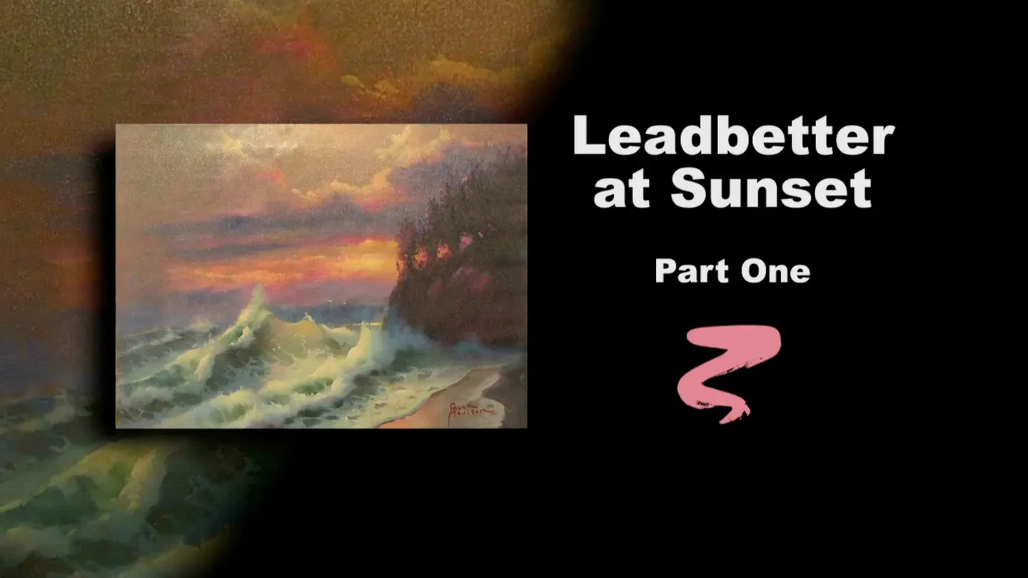
Leadbetter at Sunset Part I
3/1/2025 | 26m 46sVideo has Closed Captions
Buck uses the ocean as inspiration for part one of Leadbetter at Sunset.
Buck uses the ocean as inspiration for part one of Leadbetter at Sunset, a seascape featuring crashing waves and a beautiful sky.
Problems with Closed Captions? Closed Captioning Feedback
Problems with Closed Captions? Closed Captioning Feedback
Painting with Paulson is a local public television program presented by Prairie Public
Painting with Paulson
Leadbetter at Sunset Part I
3/1/2025 | 26m 46sVideo has Closed Captions
Buck uses the ocean as inspiration for part one of Leadbetter at Sunset, a seascape featuring crashing waves and a beautiful sky.
Problems with Closed Captions? Closed Captioning Feedback
How to Watch Painting with Paulson
Painting with Paulson is available to stream on pbs.org and the free PBS App, available on iPhone, Apple TV, Android TV, Android smartphones, Amazon Fire TV, Amazon Fire Tablet, Roku, Samsung Smart TV, and Vizio.
Providing Support for PBS.org
Learn Moreabout PBS online sponsorshipIf you want to touch another person with your art, then you better put feeling in your paintings.
[piano plays in bright rhythm & tone] ♪ ♪ ♪ ♪ When somebody's says, "make yourself to home."
Today I can I almost say, "I'm there."
The painting I've chosen to paint, "Leadbetter at Sunset," is 1 and 1/2 blocks from home, so I'm home!
You're going to enjoy this.
We try to give you something a little different each time.
Basically, a different painting, but a different technique of doing it.
So you watch today.
I will first show you the finished painting.
This is Leadbetter.
Such a beautiful place.
I've walked along a great park up there.
It goes for about a mile, and it's only 50 yards wide, and then you can come down a ramp and see this beautiful ocean.
We're going to do something very special today.
I want to show you now...
I have before you a halfway point, and I have a beginning stage.
What we're going to do on the beginning stage is some acrylics down below, on the cliff, in the water, on the foam, then, without stopping, it doesn't get dry, I'm going to ahead and work in the sky with oil paint.
So we're using oils and acrylics, almost simultaneously.
Wouldn't it be something, if we were in a hurry, and you went like that?
I'm sure you could do it.
I can't.
Alright, I'm going to show you down on the palettes, we'll take one at a time.
This is my acrylic palette, and you can see the oil waiting in the wings.
This is like a basketball game where this is the starting 5, then we've got all the these guys ready to come in.
So I'll take Alizarin Crimson and I'm dipping into water.
This would be one place where you want to make sure that you are dipping into the right thing.
Ok, Alizarin Crimson with water, and I'm pushing this very early up in the sky.
One of the reasons I like to do this up here first, is because when we put on the oil, we'll be working in the sky and we'll be working next to this.
So I'm not worried about any detail on the edges of the trees right now, and the bank.
We'll come down there.
And then when we do the water, let's have a little bit of the Alizarin in there first, acting as sort of a foundation.
Then we'll work more acrylic right into that.
That's new too.
So we're doing almost a monochrome with the Alizarin Crimson, and then we'll put color into the monochrome.
Back here-- where are you?
Oh, there you are.
There's the horizon back there.
Just a little bit showing here.
I believe, I'm not sure, but that we'll have a stronger chance for a good light there.
Oh, yes.
The one to the left is not the original, so we'll see that when we come.
Ok, like that.
I'm not putting much on, but a little bit into the waves, sort of where we'll see the water coming through.
It looks like I'm using, just kind of in a rough way, which is fine.
This is a wave here too, so just a little bit of the water within the waves showing as the Alizarin stage.
This is a dark underneath there.
Very soon we'll be putting a dark right into that.
I think that will be enough after I place the last one right in the corner.
This will represent the land, and the water's creeping up on it.
Not doing too much blending, just have it on there.
Ok, as we go to the next part, this is Paynes Gray and Turquoise Blue.
Let's see what the proportion is: 1 Paynes Gray, 1 Turquoise Blue, that's white, that would be 2 white, and we'd say, oh my goodness.
That's what I want.
So that's the formula-- 1 Turquoise Blue, 1 Paynes Gray, and 2 white.
I'm cleaning this in the water and I kind of smile because I think, yeah, that's water, I didn't dip into the oil.
You have to be sure what you're doing if you're going to play this type of game of two things at once.
Just blocked in, being a little help for us.
Let's see what happens over here.
Just a little bit of the wave continuing there.
You'll notice when we have the eye of the wave, we don't put anything in that in this stage.
We'll allow that pink.
By the way, this is Alizarin Crimson, white... actually you'd say white first because a lot of white, some Alizarin Crimson.
Maybe about 4 white, 1 Alizarin Crimson, and just a little touch of Turquoise Blue.
It just grays it a little bit, rather than just pink and white, red and white.
Alright, we'll come over further to the larger wave.
This one splashes up a little bit.
Gee, this is almost patriotic.
I should put my hand on my chest and stand at attention!
The red, almost white, and blue.
Ok, a little bit lower there.
A little bit on the shore edge.
We'll put some along the cliff.
This sort of separates it from that, and then the little edge of the little foam coming in there.
And there truly is just a little bit of foam in here too.
That, I may have to put on after I've put the dark on.
Let's, on the dark we'll use, I have some Viridian Green.
I'll better mix it with a knife.
There's Viridian Green, and I'll start out with the idea of 1/2.
So you got 2 green, 1 Paynes Gray.
Ok, I'll clean the brush in the water.
You can just swish it around.
It's fun to sometimes watch the water early, how it changes a little color.
This will go on the front... and we'll come under the big wave.
See, I'm rushing this, but knowing that it will dry and we'll be able to work with it.
I have just a little bit of this coming down inside here for the water showing within the wave, and then under the wave on the distant one, second one.
This is a nice one because it splashes up.
He's kind of riding piggyback on the one that's in front of him.
And just a little bit back there, and maybe a slight bit, just to soften that a little bit.
I will come with just a little more acrylic, then I'll stop.
And that is in this area.
I left just a little bit too much red, so this is a little bit more of the blue.
That cuts that in just a little bit.
You can smooth this out and be just a little more careful.
Of course, I had the drawing on there, so I already knew my composition.
And you might ask, is this the way the scene looked?
This is the way it felt.
That's the way it felt.
Sometimes I'd lay down on the beach so those waves would look real high.
Ok, that finishes my acrylic.
I just used one brush there.
So we'll now go ahead with our oils.
When we come with our oils, I would like to put Walnut Oil on the canvas.
We'll move that water over there, too.
So we'll take the Walnut Oil-- and I have to be a little careful, because there's a lot of wet acrylic paint there.
So I'll use my bunny brush and ask him to be careful.
You go up here...oh, that's fine, it's not running.
[soft scraping] Good.
Just like that.
Ok, now I'll mix up, and when I'm mixing the paints for this, I'm basically doing them right in front of you.
So I'll start with some white and we'll put out some Yellow Ochre, and then we'll put just a little Turquoise Blue into that.
Or Cerulean--or Manganese rather.
I have Manganese.
Let's--turquoise, Manganese.
Turquoise, manganese--manganese made it!
Isn't it something.
Have you ever been, where you've been in a competition, and they're trying to choose and select?
It's so nerve-racking, isn't it?
You run to the bulletin board to see if you made the part in the play.
I've done that.
Now I'm holding this up and looking there.
That's a little strong on the blue, so I'll just come over on this edge, which has more of the Yellow Ochre and white in it.
Ok, let's go ahead with the fan brush.
The fan brush is a little more aggressive than the bunny brush.
The priming of the canvas certainly is a part of this, and I all of a sudden, when I realized that, I thought, ok, to make sure it is, let's not overdo on this.
I don't mind putting it on and wiping it around a little bit.
That might remove a little bit.
Smoothes it out slightly.
And there's places that you can still see the pink, and I like that.
Let's go over to the left.
And over to the left I'm going to take a touch first of, this is the Turquoise Blue and we'll touch into that.
Just a little more powerful, a little darker.
What about a touch of violet into it?
Ok, so up into this area.
This will be such a nice head start, to have our water all dry, and just to have the sky just a little more fluidlike, you can work with it.
So at home-- I'm just showing you you can do different possibilities.
If you want to use all oil, do so.
If you want do all acrylics first, fine.
If you want to do acrylics total, that's fine too.
I'm constantly watching now, how much of the pink should I let come through?
And I look at the model over here which is the finished stage 1.
It does have pinks coming through.
And that was done just the way we're doing this one.
It was done with acrylics down below.
It was done with oils up in the sky.
What I like to do a little bit too is, for instance, here.
This is not the color of the cloud, but if I have a little wet paint there, to blend into, then I have a little softer look on the sky, on the cloud, when I come to it.
I come down low.
It's surprising with the studio lights, that that would already be dry, although I can see some that's a little wet, and I'll play around it as if it were all wet.
Let's go over to the left just a little bit.
I'm putting just a teeny bit of walnut oil on, because I'm using such small amount of paint and on purpose, that I need to spread it, and the walnut oil does it quite well.
What happens if you get the oil and acrylic mixed together?
Don't!
That's it!
But if you do, it's very thinly, such a small amount touching each other, you're not going to have the problem of it cracking.
That's what you're always concerned about if you're not careful.
Ok, now that I've filled in a little bit there, I think what I'd like to do next, before I put the clouds in, let's put in the strong light in the middle.
And that is in the orange family.
I'll put a little Cadmium Orange out there, we'll add a little Yellow Ochre to it, and then we'll see.
This is some more white just in case we need it.
What I appreciate a little bit on this series, a lot of the mixing is being done in front of your eyes, rather than having premixed formulas.
Those work too; I don't say they're wrong.
But let's take this.
Yellow, and I went to yellow, and then I'm picking up some of that Yellow Ochre and white.
So that is equal parts of orange, and yellow, and then you're adding white.
And I would say just a small touch of Yellow Ochre, and that's what we achieve like that.
I'll take and hold this up too, what we're calling an original, at this time, because that's right before us.
It's such a nice way of doing it, because you-- I've added just a little rose into it down here.
What often happens, you mix a color on the palette and you go to put it up there, it shocks you.
If you have something to gage it against, that works well.
I've often taken a completed painting, you might put Saran Wrap over it, and you come up and touch actual paint right on the Saran Wrap, then it's even easier to tell whether you've matched it or not.
Let's go ahead with a little bit of a bunny brush here.
This is my star performer today.
You'll notice when I picked that up and put that on, it had a little quantity in it.
A little quantity in the paint.
Now, what I want to do very quickly in here, because I can see as you put this on fine, but as you start blending out, what happens?
The blue makes it just little towards the greenish look.
So to surmount that we'll use a little bit of the Quinacridone Rose.
I'm just dipping the brush.
I dipped into the rose; I dipped into the white.
And let's see...go just a little stronger with the rose, and then we'll come right against it.
Oop, I need more... Darker!
That's it, that's it!
I get so excited doing this.
When you do it this way, kind of painting with risk, you learn with it, you ave enthusiasm while you're doing it.
Oh, I love that!
Each series we try to introduce something just a little new, that'll make it exciting for you.
And you know, it happens when you go into your studio and you're working, it's not all excitement.
Sometimes it's a lot of work and it might be a little frustrating, but that's alright.
You still show that you're willing to stay on the trail.
I'll blend that just slightly.
Ok, now let's make a cloud.
What do I want?
I want some violet and white.
That's about 2 white, 1 violet.
Then let's come over and take some of the Turquoise Blue.
Oo, that's powerful.
I hope it's good.
More violet.
So that's 4 violet, 1 white, and a touch of blue.
Now I'm going to hold this up.
I'll hold this up... ah!
that will work.
And see, when I come over this way it's not as blue.
My first impression would be, will it work by thinning out over on the left?
Or do I need to add another color to it?
So I'll take the fan brush, dipping in, and I'm coming right close to the cliffs.
I keep wiping the brush, because I want to work what's there around, rather than saying, ok, let's add more or so on and so on.
Ok, now as I come over, I'll push into it a little bit.
A little lower.
Oh, I can see what's happening there, so we'll need a little more pink in just a minute.
Let's just wipe a little bit.
Now, you don't see a lot happening when I wipe, but it'll work so that when I come with another color it'll be less to dig into.
Let's just keep pushing this over.
And because it's quite soft now, you can see it's truly a different color than it is on the right side.
[soft scraping] And a small little cloud down here.
I'll just borrow some of this paint.
Come down there and see if I can borrow some of that same paint, and come down to the horizon.
Yes, that's plenty.
[soft scraping] It's just really fun to soften wet into wet, that's such an important aspect of my type painting, wether you are using acrylics or you are using oils.
What you have down at the lower part is, these are distant islands.
They call it, what do they call them?
The Channel Islands.
They're about 20 miles away from Santa Barbara, out in the ocean.
And what's nice about them, they're beautiful, but when you have the huge waves it sort of knocks them down a little bit.
So that makes it just a little bit easier to save your shoreline.
Ok, now I'm going to go back to the, above the little sun area, and I'll choose to take some paint with me.
Let's take some of the Quinacridone Rose and white.
Let's see, just, oh, here you are.
I'm sorry.
I didn't even see you!
Alright, let's come up here and we'll go right in this area, so we're kind of putting this change into it from the bottom up.
And down here, just a little more pink, so it isn't quite as orangy.
Ok, let's push this around.
Let's put a little bit of pink up in there.
And then what I want to make sure we do is to put a little silver lining.
This is, you're white.
Taking some of that sun color and just more white with it, coming up and you put those little scallops up there.
And after I've placed these on, I'll come back and we'll blend just a little bit.
Listen you, why are you so reddish?
We need to put some on there so it's not quite so reddish.
It's such a temptation to put the strong light in there.
It will happen, but it's not yet.
Just a little stronger with the red.
I'm probably overdoing it a little bit, but oh, I love what it does!
A little bit there, and now, let's take and do a little bit of blending.
We have time to do that.
You guys, you don't watch the clock when you're at home, do you?
Or are you there sitting and saying, gee, he only has a couple of minutes left.
Is he going to be able to do it?
I sometimes when I watch my shows think, geez, that's close.
Ok, dry brush.
I'm rolling it around the corner to bring the light down just a little lower, so there's a softness on it.
Let's come over on this side.
Then just a sort of overall blending too, overall blending.
Let's compare jeans-- you're doing "overalls!"
Let's blend this, just a little sharp there.
I just want to come down through there.
And when I come down through there, you see you make little streaks, but you can just come across horizontally and it softens them out.
Don't be too panicky.
I know where I've-- Gee, when I was doing photography 100 years ago, just a small little kit: you put something in A, you put something in B, you put something in C. I was so excited after I did A, that I didn't go to B and C. Of course, it turned right black.
Well, same way here-- you get little effects and say, oh, I don't know if I dare go further-- do it!
Do the whole sequence and you'll get a beautiful painting.
I hope that today I put feelings into the paint, and put them into the painting, and that you can do the same thing, that you can do it at home.
you can make a painting with feelings and touch many lives.
It's so wonderful to hear how others have been benefited or have shown their appreciation to you for your art.
Isn't it great what you can do with it?
And people do so many good things.
They sell them, they give' em away, they enter them, they donate for worthy causes.
They're using their art to make life better for others, and for themselves, and I congratulate you.
One little touch as we go away.
Just pushing in here.
Oo-hoo!
You're beautiful, but I need to soften you quite a bit.
Aw, I like that!
You may not be in the finished product, but I'll tell you what, I sure don't dislike you now.
Because that keeps the interest more over here, and it's so hard not to be stepping out there and trying again.
I hope you come back next week, because we're going to go on and finish this painting for you.
See you then.
♪ ♪ ♪ ♪ ♪ ♪ ♪ ♪ ♪ ♪ ♪ ♪ ♪ ♪ ♪ ♪ (woman) Funding for "Painting With Paulson" is made possible by...


Support for PBS provided by:
Painting with Paulson is a local public television program presented by Prairie Public