Painting with Paulson
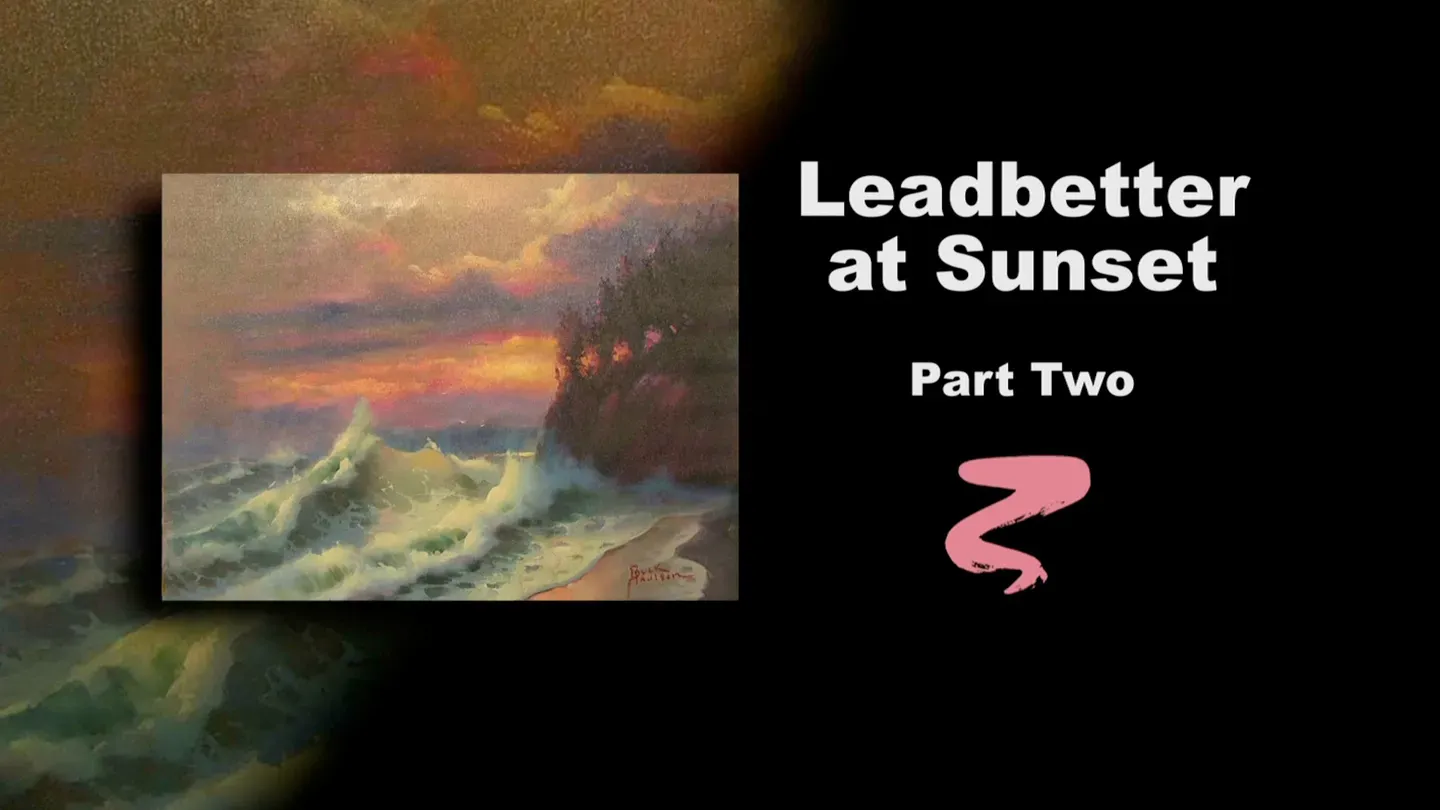
Leadbetter at Sunset Part II
3/1/2025 | 26m 46sVideo has Closed Captions
Buck adds highlights and details to stage two of Leadbetter at Sunset.
Buck adds highlights and details to the ocean and sky in stage two of Leadbetter at Sunset, giving his ocean scene power.
Problems with Closed Captions? Closed Captioning Feedback
Problems with Closed Captions? Closed Captioning Feedback
Painting with Paulson is a local public television program presented by Prairie Public
Painting with Paulson
Leadbetter at Sunset Part II
3/1/2025 | 26m 46sVideo has Closed Captions
Buck adds highlights and details to the ocean and sky in stage two of Leadbetter at Sunset, giving his ocean scene power.
Problems with Closed Captions? Closed Captioning Feedback
How to Watch Painting with Paulson
Painting with Paulson is available to stream on pbs.org and the free PBS App, available on iPhone, Apple TV, Android TV, Android smartphones, Amazon Fire TV, Amazon Fire Tablet, Roku, Samsung Smart TV, and Vizio.
Providing Support for PBS.org
Learn Moreabout PBS online sponsorshipTrue victory is not in every painting being a success, but in our willingness to go on, even when it isn't a success.
[piano plays in bright rhythm & tone] ♪ ♪ ♪ ♪ When is a painting a success?
Let me read couple of multiple choice questions: When it is finished?
When someone buys it?
When I say so?
When the painting says so?
So you think about that and you send in your answers to this phone number: 0000-0000.
We're going to have fun.
We're going to make this painting a success.
You'll recall this is part 2, and last time we did acrylics on the lower part and we did oils on the top part, but what was different: we did them in the same show, without stopping.
And that was very nice.
So now let's go to the painting, and we will start in the sky.
I'll take a bunny brush, dip into the walnut Oil, and when I put the walnut oil on, I can put it on so it goes over the whole canvas.
It's not going to dry that fast and it will let me go ahead and work in the sky, then I won't have to reoil when I come down on the lower part.
[soft scraping] I like what that does, and then I'm going to put a glaze into the sky, but we won't necessarily hit the waters.
We're doing just a little bit of Saturday night half bath!
It's like one of the kids getting in there, and not completely cleaning behind their ears.
This is-- you're violet, Quinacridone Violet, and I'll push this into the sky.
[soft scraping] Oh, gee, I love that!
Ok, let's take more.
The thing about more is, I don't worry if we have a little extra, because we can take and use a paper towel, and kind of rub it off when we need to.
This just thins around.
It makes it nice that you have that nice feeling of that kind of grape look throughout.
Oo, isn't that pretty?
I love grapes-- when they're in season.
[soft scraping] Just a little bit more on the 2 edges.
Ok, I'll wipe with that.
And then we'll kind of put on what?
Let's put on the clouds first, and then that will kind of suggest how we approach the brightest sun area.
The brightest sun area will-- I'm wiping a little harder, not too make it lighter, but just to make sure we have a little paint there.
So, we'll come down to the palette and I'll mix up a little paint.
I'm bringing white over, and I'm going to take a little bit of Yellow Ochre, and I'll take a little Cadmium Orange.
Set those like that.
Now I have the white, then we start adding in equal amounts of Yellow Ochre and orange.
That looks pretty good.
I have the painting, the original, close enough to me that I can hold this up and evaluate it.
I think that will work.
Now let's take a fan brush, the thing about the fan brush is, it does a lot of work quickly and it has that accidental quality.
Accidentally great!
So I want to make use of what's already there, but I'll push this on a little bit too.
I'm going to backtrack just a little bit.
Come on back down here, and let's see if we can take the orange, and yellow ochre, and put just a little bit of a glaze.
This is equal parts.
Put a little bit of glaze up above.
It'll have some warmth there, that I didn't feel was there.
And I'll wipe just a little bit, so it's not taking over.
[soft scraping] And I really want to have this touch against the clouds, so I'll push down a little bit and then I'll come against them again.
You know what I'll do?
I'm going to wipe than off and then bring this glaze down, so I have something a little warmer to blend into.
Then when I put the clouds on they won't look quite as cold.
So I'm back with the same cloud color: Yellow Ochre and orange and white.
You'll say, "well, I don't see that much difference."
You don't see that much difference in what I just put on, but you see the difference in what it goes against out in the background.
It's just a little warmer.
I prefer that.
I hope it works for you.
If you want it cooler, you do it the other way.
There's only 2 ways in the world: the other way and my way!
Ok, you can see here I have a little more paint.
And I'll do the same thing.
I'm going down the palette, picking up the same thing.
I want it a little stronger there than out on the periphery.
Because this is right above the sun, so the direction there is pretty good.
Now look at what I'm going to do next.
I'm taking the same color and I'm going to come up where we put this.
I don't want to put character there, but I do want to lighten that area.
[very soft scraping] Oh, I love this, painting with risk.
Use your instincts, use faith, use guidance, and it's going to work!
You're not panicky on it.
Coming down to the clouds, I can see some pinks that are quite nice.
Quinacridone Rose, where are you?
Is this you?
Yes.
Quinacridone Rose and white; oo, that is so pretty.
I love that pink.
So I'll put it right in here, and some of these, the pinks being one of them, I'll let set for a while unblended, and then we'll come back and softly blend.
It just let's it set up a little bit, and it also gives a little chance to judge it.
How much blending do I need to do on that?
I don't know right now.
So if I wait, then I'll be more accurate.
A little bit over in here and we'll be putting some more down here.
Should we do it now?
Let's wait and see if we have what we want for the clouds.
For the clouds, I'm looking at having my blue, this is, you are Turquoise Blue and you are white.
Kind of dipped in the brush, back and forth, almost equal parts.
Blue in that.
Let's put a little bit of the violet into it.
Oh, yes.
See how he difference between the violet added, than when it was just blue and white?
Ok. Oo, you are beautiful!
You are beautiful.
I'm pushing a little bit into the pink, so we get that nice gradation into the pink, that transition from pink to blue.
Now as we go over further, I will come down to the palette, gee, this is one time I'm using the brush more than the palette knife.
Let's have a little more white in it, so when I go to the left, it's a little softer.
Again, I'm hitting into the pinks slightly.
That helps soften it, and you retain the vitality of the pink at the same time.
We'll come down on this row.
Ok, going back over on this side.
Look up here.
I have the dark blue, but now I've chose that which is lighter to come there.
Simply so that the accent of the trees will be very nice, and you'll feel like you can go behind the trees, that there's space behind there.
I'll push up here.
That might have been a little dark anyways, so this helps.
One place, I look right in there.
I want to have a little bit of that orange color.
I clean the brush: I dip in, wipe on the edges, so I basically keep my walnut oil clean.
I come down to that first color that we glazed with, and I'm coming right up in here and I want to have a little less sharpness right there.
So this pulls this down just a little further.
Then next to that, I'm going to run down and get some pink, and put some more pink on.
Here's the pink.
And I'm using some pink down here now too.
Let's go lower.
Right in here is a little pink.
A little pink going over there.
I'm letting it set.
I'm letting it set.
And we are going to blend later, but let's come now, let's go-- what do we have?
Ok. Now we'll come with our palette knife, and I'll use-- this is Yellow Ochre, orange, and white.
I had you mixed on this side there, so I'm telling you this time.
Equal parts of orange, Yellow Ochre, and white.
You might have to make the white just a little stronger.
This is a home for the sun.
So as I place this on I want it to blend out a little bit into its neighbor, into its neighborhood, which is that kind of that little reddish pink look.
Notice how I'll take and blend with the knife, like that.
It's not a real soft blend, but it's adequate.
Ok, now we'll come with yellow and white.
This is truly the impact in the sky.
Yellow and white.
I've got to much white there, so I'll just come over here.
How'd the pink get in there?
Hoa!
You're beautiful!
Here comes the yellow and white.
Let me come back to the palette.
I want you to see this.
See how that looks?
Ok, now I'll come up.
This'll be another time where I don't mind it setting strong like that for a while.
Let's go down to the cliffs, because it'll make such a nice impact so early.
And we'll take our violet, and what do you want to have as a friend?
I will take and put you with Paynes Gray.
Let's try equal parts first and see what happens.
Well, we changed it to 2 violet and 1 Paynes Gray.
Now with the fan brush.
♪ Boom boom ba-ba-boom!
♪ Oo, that is so powerful, and you can watch very quickly what happens out in the sky area.
Now, when I put this on the trees, you just sneak up into the sky just a little bit.
And you can see, as I come here, that I leave a little bit of holes between the trees, so you're seeing some of the sky in-between.
[very soft scraping] Oh, love that sound!
I going to take just a little extra Paynes Gray, so over here it's equal parts, it's much darker.
[very soft scraping] And again, as you come, you're watching the edges.
Just a little soft character up in the top, and I'll come back down.
When I'm doing this time, I'm going back more towards where it's equal parts again, so it's just a little more reddish.
Again, you have the "see-through" effect.
Keep wiping the brush, so that I don't have much paint when I go up higher.
I'll blend this just a little bit.
Soften it slightly.
And then we'll use a paper towel, which will-- let's come down the edge here, just a little bit stronger.
The paper towel will make it so that we could wipe and retain some of that pink that was there.
So we get a feeling of some light hitting that cliff, and you know very well, some of that light is going to come through those little openings.
I'll make that just a little irregular on the opening.
What that means is: why couldn't we have a little pink?
This is Quinacridone Rose and white.
Look at this-- the light's hitting through.
It's hitting through some the trees.
There-- isn't that pretty?
Isn't that a sparkle?
And I'll put a little bit of that with a knife, just around the edges slightly of the openings.
Ok, we'll leave this area.
I'm scrapping just a little bit, so that we don't have it quite so strong, so dark down at the bottom.
Although, while I have that, I'll put just a little bit of that on the shore down there.
Ok, let's go ahead and go down to the water.
We'll first start, I have some, you are Paynes Gray, and I will use a little bit of Viridian Green.
This won't change much from what's there right now, but it'll be wet so we can work into it a little bit.
Ok, now let's take some Viridian Green and a little white.
Oo, that's pretty!
You just feel like it's the ocean, and I should know, I've spent many years there.
When our director, the producer, was just being born, I arrived in Santa Barbara.
So I've been seeing the ocean her whole life.
I can't tell you how many years that was!
Oh, that's beautiful!
Ok, we'll put the same thing down here.
Now we'll clean the brush.
Dip it and wipe, dip it and wipe.
And I will take some, let's see, this is white.
I have a little bit of that, which we had in the sky.
Let's try that.
Oo, I love that!
Place it on, and then wipe your brush, and work with what's there.
Zigzag and blend.
We'll get a great eye to the wave.
Oh, that's so pretty; I love that area of the wave.
A little bit out here, not much.
So when I put it out there, I didn't leave a spot for the orange, therefore it's not as light as this is.
And that's on purpose, it wasn't an accident.
I'm just softening the water out there.
Softening a little down here.
We'll take some of that same orangy, Yellow Ochre color that we've been using a while.
We used it up in the sky, and we'll place this down here.
You're showing this as being a reflection on the shore.
Even though light travels in a straight line, you're going to find, because we can't see the shore down there, that we go very light, the nearest part we can put the light on.
Alright, I'll come down next with a little bit of, what are you?
You're what was in the sky, my blue and so, this is, you are Turquoise Blue, you are Paynes Gray, and you are white.
And I'll put this on, just suggesting little foam patterns lying down there.
Oh, this is so neat.
To take this brush and to do the little details.
I'm sure some of you out there think, Buck, you usually used to use a small brush.
You don't have to when you know what you are doing.
The whole thing is to represent accurately, this ocean.
And it's working, it's working.
I'll just blend there a little bit.
Too much red coming through.
You can see how powerful that acrylic was underneath there, the Alizarin Crimson.
Ok, we'll come into the next area.
This is also foam patterns.
We might, after we do this, you might say, we'll put a few little small ones in with another brush, and that's fine.
Just sort of establish those in.
Let's take a small brush.
This is liner brush, and I have a lot of oil in it.
You really soak that paint on it, then you come up and you can just make your little ones.
Can you see those?
You can see them a little bit, can't you?
I think you'll see them more when I come into a darker area.
I ran fast, I chose to go just a little darker.
Ok, here's the back ones.
It's almost like a number 3.
Make a 3, oh, that's a capital E!
3 would be the other way, Buck.
[deep exhale] Yes.
See, those all lie on the surface and they're from the previous wave.
Previous wave coming in that drops off foam.
Here's one back here just a little bit.
And I want to put some in the eye of the wave.
Just a little lighter.
But you know what's also a surprising thing?
When you do foam patterns, you can take in the dark or lightest area-- now when I do this you think, Oh!
Because they're silhouettes.
Darker-- little silhouettes.
Ok, now we need to put some big foam on.
When we do this, I'll first take a little bit of the gray color, what we've been using for foam patterns and other things.
And when I go on this wave you'll see it's just a little grayish green.
I guess you'd call that yellowish green.
This makes it so we get a start towards putting the highlights on.
It allows some of the previous color to be there, but you have something that you want to work into.
A little bit more on this next one, then we'll put on some lights.
Then we'll just have time to do a little bit of blending, and that will take care of our Leadbetter.
You know, when I mentioned earlier, I think in part 1, and I'm taking with a knife, some quantity of paint.
We'll come back here and put a little bit of an accent on.
Then with the yellow and white, same thing, same thing, just a little bit on there.
Ok, let's put just a little bit final lights on.
I have taken a mop brush and I'm going to go very light with this, yellow and white.
I guess there's just a touch of Yellow Ochre too, but this is, look at this.
This is where it happens.
This is where we get our vitality into the wave.
I'm running back and forth, and I'm picking up the same thing each time, with this nice mop brush.
It also is quite soft, so you'll almost blend it enough as you're using it.
Ok, let's take the bunny brush.
Are you clean, bunny brush?
[in high voice] Not overly!
But we'll take this and kind of blend.
We'll blend into the sky; we'll blend across that pink.
And you can see how much of the pink I could leave.
On the sun area, I'll flatten with the knife... then blend just a little bit, kind of a tap blend.
Then on the big wave, just gently across on the foam patterns.
We'll push this around a little bit.
And I don't mind if you have just a little color mixing.
It might be a little pink from the sky that's on the brush.
It works into that foam.
Alright, this one... We need to have a little light.
I'll use a knife.
We need to use, I have a little light right in here.
See that wave?
This is right in the path of that sunshine.
I'll take, this is going to be just almost your final thing.
I'll take a little yellow and white, and I'll put it on that side of the knife.
And we'll come up here, and make a real nice edge to that front wave coming in.
Often, what helps when you have an edge like that, and I'll take some violet to do it, is where you have just a little line under the wave.
One last thing, we have just, time to say good-bye, not quite!
Take a little blue and white.
This is a little darker than what's there.
See, that's shadow foam, shadow foam over there.
Now we've run a bit fast on this, but you get the idea.
And you have the original painting to look at, so you can see how it should look.
These are the ingredients, this is the recipe.
Then you cook and bake it according to your interests.
I so thank you for watching today, and if you're ever out at Leadbetter Beach, drop in, and see me!
Bye, bye!
♪ ♪ ♪ ♪ ♪ ♪ ♪ ♪ ♪ ♪ ♪ ♪ ♪ ♪ (woman) Funding for "Painting With Paulson" is made possible by...


Support for PBS provided by:
Painting with Paulson is a local public television program presented by Prairie Public