Painting with Paulson
Remembering Claude Part II
3/1/2025 | 26m 46sVideo has Closed Captions
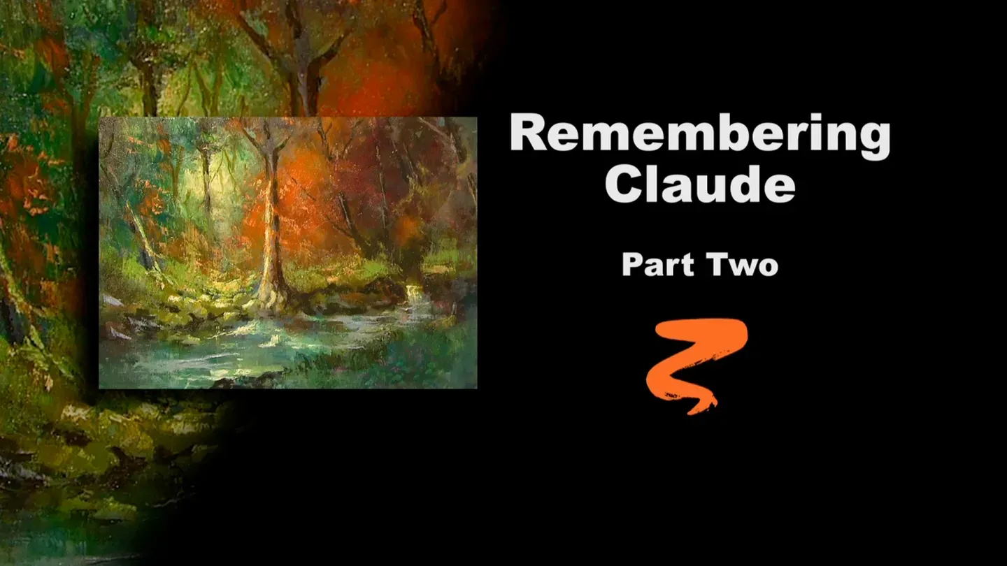
Buck paints stage two of Remembering Claude.
Buck adds color to the trees and highlights to the water as he finishes his tribute to Claude Buck.
Problems with Closed Captions? Closed Captioning Feedback
Problems with Closed Captions? Closed Captioning Feedback
Painting with Paulson is a local public television program presented by Prairie Public
Painting with Paulson
Remembering Claude Part II
3/1/2025 | 26m 46sVideo has Closed Captions
Buck adds color to the trees and highlights to the water as he finishes his tribute to Claude Buck.
Problems with Closed Captions? Closed Captioning Feedback
How to Watch Painting with Paulson
Painting with Paulson is available to stream on pbs.org and the free PBS App, available on iPhone, Apple TV, Android TV, Android smartphones, Amazon Fire TV, Amazon Fire Tablet, Roku, Samsung Smart TV, and Vizio.
Providing Support for PBS.org
Learn Moreabout PBS online sponsorshipHow do we finish this painting today?
I don't know...yet.
[piano plays in bright rhythm & tone] ♪ ♪ ♪ ♪ You must be willing to take a risk, and that's what I'm going to do today.
You don't fail when you take a risk-- you're a winner!
You win the game.
You may lose the score.
It seems like that relates, but I don't know how.
Ok, let's go ahead.
This is part 2.
We did part 1 with oil paints, we're doing part 2, it better be with oil paints, because acrylics don't go over oils.
I will dip into the walnut oil, with my bunny brush, who's been off suspension and back in the palette.
Oh, I love ya, bunny brush!
Look how nice that painting looks.
Now, this was done with oil, previously, oil paints.
So all we needed to do, all I needed to do, was make sure that it was dry.
You know, I've been painting many years on PBS.
Many years with Prairie Public Television.
And you almost feel like the camera people are going to come up and say, "now you're going to do this, now you're going to do this."
But you wait today.
You watch what we do now.
We're going to take and put on some clumps of color.
This is Quinacridone Violet, and why don't we just put it there.
Ok. Then let's go over, let's take some-- I was looking over to see a model.
I don't have any-- this is it, this one's going to be the finished one.
Let's take a little Viridian Green, and we'll just place that over there.
Let's take a little orange-- boy, I don't know what you're getting into, Buck, because I have not done this way-- on air or off air!
Oo, that's pretty!
A little like that, a little up there.
I hope you came into the room at the beginning of the show, so somebody's not coming in and saying, he's ruining that painting!
Even though you've been be sitting there a while you may say, [deep voice] hey, he's ruining that painting.
That was a guys voice.
Did you hear that?
[high voice] It wasn't a woman's voice.
The women, they know what's going on.
Ok, here's some Azo Green.
A-Z-O Green.
It's a kind of a golden green.
And let's put a little bit of Manganese Blue in the water and over there.
Ok, we'll see you next time!
It almost seems that way, doesn't it?
Ok, let's do this.
Let's push that around, and I think what I'll do is use my bunny brush.
I don't care where I start, just start in the right place.
We put on the violet first, but I'm going to move that around last.
I'll go over to the green, which is over on the left.
Push this around.
It's kind of a little glaze we're doing.
As I push that around, I'll sneak that into the lightest area, so when we put some light on there it has something to blend into.
That's beautiful.
Now, coming down, still, let's see, what are you?
What color are you?
I think you're Manganese Blue.
Let's stay with the Manganese Blue then.
Oo, that's pretty!
You watch as you blend.
Some places I blend it out a little more.
Other places I'll let it be a little more dominant, that you can see it.
So that's what I've done there, shown a little more.
In fact, I'll take a little more of the Manganese Blue, just to have more quantity over there.
And I'll let that go up right across that rock.
Oo, that is so pretty.
You know, on this stage, you're not saying, "oh, I've got to hurry, do a whole bunch of things."
Just the glazing is good.
This is like taking a Saturday night bath with 5 different soaps!
That's what we're doing, it's a Saturday night bath with many different soaps.
Still taking the Manganese Blue, which we used over here.
We'll push this around a little bit.
Come across, similar to what we did in the sky.
We come across that light a little bit, so that when we go lighter, it'll just sparkle.
However, I didn't touch that one, I really like that one.
He's down next to the rock.
Quite a nice accent.
Into the lower right, I have some Viridian Green, so I'm pushing this around.
Oh, there's a little blue there too, Manganese Blue.
Beautiful.
[occasional tapping] You can kind of hear me hitting against the easel as I come down.
Ok, now what should I do?
[laughs] I don't know!
We're taking a risk, right?
I'm going to come with the Azo Green.
That is such a nice color.
It's so thin.
It's nice mixing with other colors, or in this case it's nice to use as a little bit of a glaze.
I almost said Saturday night bath, which it is.
It's a Saturday night bath down on the feet.
A different soap for the feet.
Oo, that's beautiful.
Ok, over in here, and you realize, each time I'm putting these things on, we think, oh, we don't have a model to go by.
We're just taking a risk and going on and doing it-- I love that!
This, Azo Green again, coming down this side.
Hit the tree a little bit, so it'll give me nice transition when I put the light on, I have something to blend into.
And then on the right side, I'm pushing it, so it goes across what was the Van Dyke Brown, and it just warms it slightly.
It doesn't need a lot.
Ok, now let's take the orange.
In other words, we put the violet on, and we're doing that the very last.
Here's the orange.
Pushing this across.
I was going to say, what will make it a little different than the original--you are the original-- is, I felt that it was kind of 1/2 orange on one side and 1/2 green on the other side.
It's the same season, so we're going to use a little bit of this orange, Just peeking across there.
That'll be a little more of a balance.
We have a dominant tree, and we won't change that, but just a little bit of it being reflected across there.
Choosing up teams, and we choose you.
It was the neatest thing.
One time I was playing basketball--it really relates.
Anyway, I'm blending this around.
I was playing basketball.
I went up to San Jose, taught an art class, my son-in-law says, "You wanna come over and play basketball with us this afternoon.
We meet over at the park."
So I went over to the park, and my son was one of the choosers, and they had all these Kobe Bryants, and here me, you know.
So my son, first choice, "I take Buck!"
And everybody "w...h...a...t?"
and I, "w...h...a...t?"
But because he chose me, I worked extra hard.
Oh, my gosh, that's the best I ever played.
We won 2 games and we lost 1, but a memorable day.
I'll never forget that day.
Alright, now let's come down just a little bit, some of the orange down there.
Sneaking over just a little bit there.
I'm really rushing back and forth.
Now, now the violet!
Why are you there?
You're there to do your thing.
It'll push a little bit into the orange we have on.
Look at that transition-- that is what I like!
And I'm picking this up, rather than spread the whole thing out.
I'm picking it up from its side and kind of move it around a little bit.
As it comes over that green it'll soften the green slightly, I'll come down a little bit with it.
And let's see, where else?
It's almost like this is my palette up here, I'm picking from it and going over to where it needs to be done.
Is there any left there.
Ok, now let's take it and push it around just a bit more so we don't have quite the quantity.
You might on the violet, it's pretty powerful, just when you first put it out, maybe a little bit less.
It worked alright for me by taking it from here and coming across like that.
I hope the camera can follow that.
Ok, oo, that is so neat!
Um.
Alright, now we're ready to put in a little more detail.
We have our feeling of detail there, but let's go ahead with our center of interest, and when you say "center of interest," my center of interest is really here, so I'm not starting there.
I want to start back there, the source of the light.
So here's what I have: I have white and I have Yellow Ochre.
I want to make sure I don't jump up too quickly, and what I mean by that, I don't get too close to white.
What will this do?
That should work alright, put just a little extra white in there.
I can kind of place this right against that, then spread it out.
Let me show you again, on the palette.
See, I have a little bit of paint on the knife.
A little bit of texture.
Not a real lot, because it's kind of a small area.
Place it right against that tree, and tap it out.
Ok, once I have that on, I'll wipe the knife, and then come and spread this around further.
This has so much quality over time number 1, over part number 1.
But you use part number one as a base, as a foundation.
Alright, let's come down in that path area, which means let's put a little light down here.
We have some from before, but we glazed a little bit with the Azo green.
So now we'll come and go a little lighter.
I need to bring over a little more Cadmium Yellow.
So I'll put that out there.
You find when you glaze over areas, then when you come with a lighter light, you don't need to used much.
But it's more of a focus.
See, so I've got a lot of light in that area.
But for the focus, you follow the straight line aspect.
I think I've told you this before, but let me tell you again, there was one time I was at the beach, up on the cliff looking down on at the beach, and the sun reflected across the ocean, right to me.
Here comes a runner, and I thought, oh, he's not in the sun yet, now he is, now he's out of it.
But when I ran down on the beach, the sun was with me all the way, and it was also all with him.
So you always have to be concerned with the viewer.
So when I put I put the light on, straight light, this is for the viewer to look at.
Notice how I can use the knife, sparkle a little bit.
And you can kind of hear that... [soft scraping] and part of it, I'm not pushing that hard, but you have a little bit of texture on the first stage.
Now I want to take a little bit, this is Sap Green.
I'll come over here.
This is mixing in with that little yellow and white, Yellow Ochre and white, whichever one, just to lighten it, so that we can have a little bit of lighter green as a neighbor to the lightest spot.
Isn't that pretty?
I just love the feeling of the palette knife.
I'm mixing up, down in the palette.
See, I have a little bit, it's not great amount of texture.
And then when I come up, I just touch it, gently touch, kind of a pull... and a little bit on this side.
Ok, before we go back in this area, I'm concerned with the path of light.
And this is going to be lightening the water and the foam.
Here's--what are you?
You're Yellow Ochre and white.
Oops, I'm sorry.
I'm jumping back and forth.
Let me show you on the palette.
Yellow and white, come up here.
And then I want to have a little sparkle there.
That is kind of the head of that wave coming along there.
And a little bit along here.
Another thing I need to be careful of: if I hold a brush up on the canvas, and you say, that's where the lightest light is.
Notice, I hope you can see that.
I come straight down.
Straight down, there's my light there.
This is my foam, so it has to be light there.
But as I come down here, I may have to move that just a little bit.
Kind of in addition.
So what you accomplish by what I just did was that you had the light coming straight down, but you retain that feeling there.
I know what I'm going to do.
I'm going to do a little adjustment.
This is Buck's plastic surgery!
Here's Van Dyke Brown.
Ok, so that's were my light was, this is where my light is.
Let's just bring over the rock closer to that.
See then you truly have that in the position that it should be.
I'll just strengthen a couple of those rocks at the same time.
While I have this paint on the brush, which is Van Dyke Brown, I'm going to put just a little accents in there.
See, when you put that glaze on, then we start putting on the lights all around.
But you also have to consider the glaze may soften your darks a little bit, and you may have to bring those back.
It's similar to the lights, is that now you don't use as many darks as you had before the glaze.
Oops, and when I say "oops," I didn't know I was working up here.
But I'm going to strengthen this one, so I don't lose that opportunity.
And then the rocks over to the right.
I really like what I've just been telling you, that after you have the glaze, the little glazes, you work in lights.
But you also, in a discerning way, decide if you need some more darks.
And when you put the darks on, it's, where do I need to do it?
Now I need a nice dark there, because it will be an accent.
I'll take some more of that yellow and white.
This time on the-- oops, you're not there.
I'm glad that I showed you, because I saw it was wrong.
Just a little bit on the edge.
And I'll come up to this little distant little waterfall.
See the sparkle you get because of the glaze?
Now I'll take a little Manganese Blue-- let's change my mind-- not Manganese Blue.
Let's take the Ultramarine-- what are you?
You are Ultramarine--geeh that's a hard word to say.
Maybe because I'm not saying it right.
No, Ultramarine Violet.
It's not a strong color, but I love the soft rays it makes.
It makes it so convenient to use when you're doing foam on a wave, or here in the distant highlights.
See, these distant highlights aren't as strong as the other ones.
It's a very secondary light.
I put this on the knife, like that.
You can hardly see it, but it's just on that edge.
Kind of a snowplow effect, then I can draw these little water movements.
I'll let that set for a while.
I'll want to blend that.
Let's come over on the big tree.
This is Yellow Ochre and white.
Again, let's go a little bit of quantity on it, but this is more towards the side.
Now, you notice I came this way, this time, because when I put this on I want to be able to put that right on the edge.
It's easier to draw.
If I had that on the other side I would be blocking myself out.
I hope, with this hi-definition, you are enjoying it as much as I am.
The luscious colors, the close-up, the detail.
Whoever invented this, thank you.
I think it was Barbara Gravel or Bob Dambauch from Prairie Public Television.
I don't know, but we got it, and we're making use of it!
Let's come over on this side and put a little bit of yellow, excuse me, this is white and Sap Green.
Geeh, I run so fast, but I wanted you to see this.
This time I'm putting the edge on there.
So when I put this on, I can again see where I'm placing it.
The distant tree.
I'm going to clean this filbert, it's a sable filbert, because I want to put just a little kind of greenish color.
What are you?
You're Raw Sienna and Sap Green, about equal parts.
Let's go ahead and try this.
I'm going to put this on.
I don't want a lot of texture, so I didn't use a knife.
But I cut into a little bit of the feeling of the brownness.
Now, what would help-- I'll use that same color, and use the same brush-- watch this.
There's quite a gap between those two.
So let's put like there's a little bit of a distant tree there, maybe a little branch.
One on this side, no, let's stay on this side for a moment.
You kind of make sure you're not making just an equal balance thing.
I'm going to come a little darker on the other side.
This is with Van Dyke Brown.
So this one is a little closer to us.
Make it stand a little straighter, the other one was slightly slanted.
Let's take a knife-- there's one small thing.
If I take some of this green-- you're Sap Green with a little white, come up, and just the smallest amount of touching.
Then you feel there might be a little bit of loose leaves back there and so on.
You still have that accent, but it's not overpowering from down front.
Now, down on this tree, I need to come lighter, so I'm using white and Cad Yellow.
I sometimes go so fast and I think on the way up, I wish they could see-- this is the same thing.
Just putting that snowplow, and there we are.
Now, what we probably should do is a couple of larger trunks on the right side.
Van Dyke Brown, let's push this through like this.
Notice how I skipped a little bit through there.
Just skipped a little bit, so you feel like the foliage is on top of that.
I love that accent against the orangy color.
You're a little strong.
Just touch him, he's gone.
Over this side we have a nice branch that comes out there.
We have a stronger and a dark one on the right side there.
I think you can see that.
If I step back and maybe distant ones just a little bit.
We don't have to come down all the way, let's one come here and let this one come down further.
Make sure the rocks on this side are a little stronger.
So we're going along real fine on this.
Now on this tree, let me just come up.
This is ok, this is ok, this is ok.
It's weak right in here.
Rather than put a highlight there I'll let some of the dark come, so that your interest is more at the bottom of the tree.
Taking the same brush, Yellow Ochre and white, which is already mixed, putting just a couple of little sparkles on the root system.
Oh, I see one thing that needs to be done.
I'll take the knife to do it.
Let's take yellow and white, boy that's high key, which means very little yellow, and just sparkle a couple of these rocks.
See, they're closer to being white than the yellow foliage above.
Come over on this side a little bit.
I have some of that same gray.
Ok, I want to go just a little lighter: orange and yellow and white.
And now, you're going to come just with a slight little touch on some of these leaves.
It's so neat to be a able to finish a painting before you.
This is stage 2 of "Remembering Claude," and how I pay tribute to him.
I once told him how much I appreciated him, and do you know what he said?
He said, "every time you paint a great painting you show your appreciation."
I hope today I've shown my appreciation, to Claude Buck and to you.
Because I couldn't be there without you.
I know that, and I respect that.
I hope that these shows are meaningful to you.
That you can understand what I'm doing.
That you can make use of them.
And if you want to change them a little bit, that's fine.
I have no problem with that.
Let's put just a little bit of... you're Burnt Umber and white.
We'll put just a little bit of that on the left side of these trees, so there's kind of a feeling of form, but not as much direct light as the other ones are receiving.
If I move over, out of the way, we can put a little bit on this guy.
We make him a little stronger, because I like that compositional effect as he goes across.
I'll take just a small amount of Van Dyke Brown.
We have, almost the time to say good-bye to you.
Let's put just a couple little branches there.
And this certainly can be done at any time.
You just fill those out.
I find that when I do trees, and you think, ah, they're so heavy, there's so much foliage, that if you use little branches, it will make them airy.
Birds can fly through them, and the birds will rest in your tree.
I'm going a little stronger down at the bottom of this tree.
We just about have to say good-bye.
Oh, it's been so great being with you!
As a final, and it's so close to your birthday, your birthday, that I need to put just a little flowers down here.
They'll be ready, they'll be ready to be picked later.
Gosh, it's been great.
It's been so great.
Painting with risk is no risk, when you have principles and you adhere to them, then you allow the paint to take it where it should go.
We'll see you next time.
Thank you.
Bye, bye.
♪ ♪ ♪ ♪ ♪ ♪ ♪ ♪ ♪ ♪ ♪ ♪ ♪ ♪ (woman) Funding for "Painting With Paulson" is made possible by...


Support for PBS provided by:
Painting with Paulson is a local public television program presented by Prairie Public