Painting with Paulson
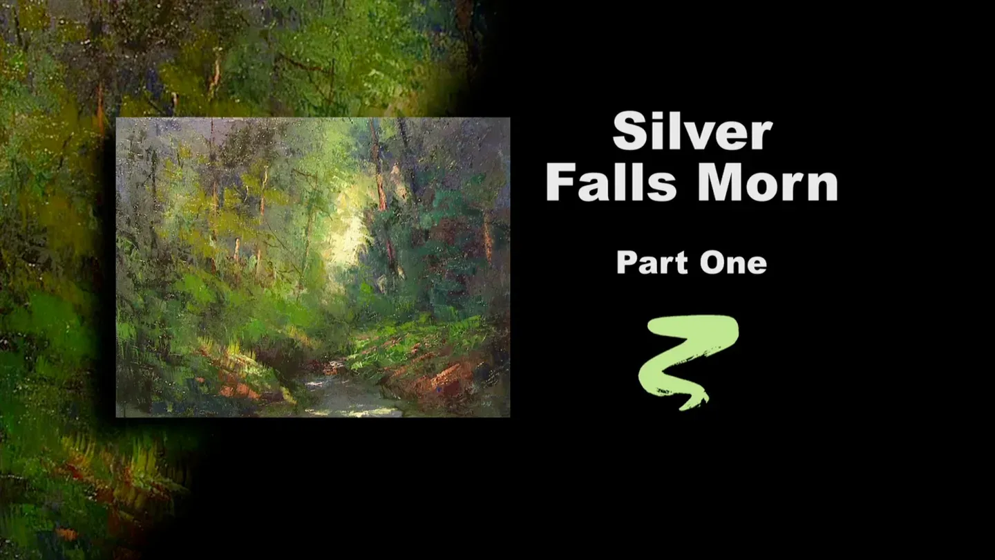
Silver Falls Morn Part I
3/1/2025 | 26m 46sVideo has Closed Captions
Buck paints stage one of Silver Falls Morn.
Buck paints stage one of Silver Falls Morn, a tranquil forest scene inspired by a pochade.
Problems with Closed Captions? Closed Captioning Feedback
Problems with Closed Captions? Closed Captioning Feedback
Painting with Paulson is a local public television program presented by Prairie Public
Painting with Paulson
Silver Falls Morn Part I
3/1/2025 | 26m 46sVideo has Closed Captions
Buck paints stage one of Silver Falls Morn, a tranquil forest scene inspired by a pochade.
Problems with Closed Captions? Closed Captioning Feedback
How to Watch Painting with Paulson
Painting with Paulson is available to stream on pbs.org and the free PBS App, available on iPhone, Apple TV, Android TV, Android smartphones, Amazon Fire TV, Amazon Fire Tablet, Roku, Samsung Smart TV, and Vizio.
Providing Support for PBS.org
Learn Moreabout PBS online sponsorshipOne man with courage is an army.
He's both the General and the foot solider.
[piano plays in bright rhythm & tone] ♪ ♪ ♪ ♪ Let's start marching that solider!
We're going to use our courage and go forth with this.
What we have, as you can see on the easel, is a small pochade, which was done with a lot of energy, a lot of enthusiasm, and of course, a little bit of background.
You bring forth a little bit of composition that sort of thing, but you're not really worried about that.
You want to capture the mood and inspiration of that scene at that moment.
Over to the left, you'll see how I've worked the pochade up into a middle stage.
So today on part 1 of "Silver Falls Morn," we are going to do some acrylics, stop after about 5, 6 minutes, and then we'll go ahead and put some oils on it.
Then next time we'll bring forth the model, which is unfinished, and we'll have to use a pochade to kind of help us gain our strength and our finish.
So we'll take that down.
We've primed the canvas, it is 1 Cad Yellow, 1 Paynes Gray, 1 Thalo Blue, and then whites, about 9 parts white.
It gives it just a little soft green, and yet it has a little gray in it too.
It's very light, very high key.
Ok, starting, we'll go right to the middle of the canvas.
I'm dipping into water with the fan brush.
I think what I'll do, I'll mix this a little bit with a knife.
This is Permanent Green Light and white.
Yes, that'll be a little bit smarter if we use a knife to do it.
Then we'll mix in the brush, and I'm further mixing a little bit.
Because I don't become too worried about the fact if the paint is totally mixed or not.
Let's put more yellow in there.
Here's Cad Yellow.
"More!?"
You haven't put any yet!
So that's green and white, and here comes some yellow.
This'll be closer to what we're looking at.
Yeah, that's a good addition.
That's part of the formula-- 1 Cad Yellow, 1 Permanent Green Light, and a lot of white.
We'll kind of spot this over places that I see it.
If anything, I'll just knock down the texture a little bit, but that's not real wrong.
When you're working out in the forest you're certainly going to have some nice textures.
So having the model there, it let's me see where I place these.
Some of them will be diminished a bit, and some may be expanded a bit, as we go to the oils.
Alright, let's come down to the palette, and what I'm going to use here, still the Permanent Green Light.
I think I'll put a little bit more out, but this will be a little darker, so it will have less white.
That's Permanent Green Light, maybe touch it a little bit with that yellowish tone, and I see some over on the bank.
I see some right down close to the middle, and I see some down on this bank.
You know what's so pleasing?
Is when you do this and you have a tone on the canvas already.
See that light grayish/green color is so compatible with its neighbors.
It's just beautiful.
So this is what I like, so that each stage you feel, that looks pretty good, that looks pretty good.
It's a little easier to judge than if you're putting on white and you think, oh, that's so strong.
Will it be better when I get it covered?
Now, it's good as I'm covering.
So we re-cover!
I wonder if that-- I think I'll do just a little bit of the dark.
So on that, let's see what we'll take.
We'll take, you're Paynes Gray.
Let's take some Paynes Gray, mixing in with the green.
Paynes Gray and green.
I can't leave you without your neighbor, your neighbor is so good to you.
A little turquoise blue.
So I have turquoise blue, I have Paynes Gray, and I have green.
I could call them equal parts.
It sure would make it easy to understand.
This is so powerful when you put that on and you see it blend out.
That blue that wanted to come along, how much of it we feel it in there.
You're doing your job, I'm glad you came along.
Ok, we'll put a little bit up here, using less paint, it won't look quite as dark.
Push a little bit over here, then when I go on the other side let's see what we want to do there.
Were not ready to go over there yet.
I'll take a little bit more of the color.
I dipped into the water.
Push some down here.
I'm not going to cover all of this with this, because I like the effect of what the oil does very early too.
We'll put some of this down low.
I just find if I have some of these washes on, then when I come and I do a lot of knife work-- you're going to have a lot of knife work on this, then you don't mind if some areas aren't covered, because you're seeing some of the acrylic show through.
So that's very helpful early.
Ok, coming down to the palette, I'm going to take white, and mix just a little blue and a little, what are you?
You're Alizarin Crimson and blue.
Ok, let's come up here, and we're pushing this around.
And oh, is that pretty.
Just a little more Alizarin.
I like the effect you feel the Alizarin being part of it.
There, that turns it, not too much, just a little warmer.
So I want to do one last thing before I go.
I'm almost thinking, gee, I've got to equal that stage.
I sort of forget that we're going to put oils on this too.
Here's Burnt Umber.
Burnt Umber, flat sable brush, a little water, and we'll place the trees on just a little bit.
And when you do it, it doesn't matter if you pull through some of the foliage that's there.
You'll lose the trees again as you, I mean you'll make them less distinct as you put foliage over it.
One here, then we have quite a large tree on the right side in here.
I hope-- I'm not blocking, I don't think.
This is a larger one.
Oh...that's almost great.
Come towards the middle.
I'm giving more water and less paint as I come towards the middle, because I want just a little bit-- like that.
Just a kind of suggestion of it-- neighbor.
Not much, then we'll go heavier as we come back into this area.
We'll put this one in and one more, then let's say that we'll go to the oils.
See I haven't put in the water, I haven't put in the bank, but I'll do that with oils.
This is merely to help me, so that when I come with the knife, a lot of what shows through will be other than the bare canvas.
Ok, we'll stop there, we'll see you soon.
Dryer!
We're still on part 1, but now we are going to the oil stage of part 1.
We did just a few minutes of acrylics, and they are dry.
We'll start by putting some walnut oil on the canvas.
I don't need a lot of this, because I'm going to be using the knife.
But it does even help the knife work push around if you want some small little areas of transparent color.
I put that on and I'll wipe, which both removes a little bit, and it spreads it around evenly.
Then I don't have to dip into the medium anymore.
Alright, now we are ready to take the knife, and let's go to the palette.
We'll first go with our mixture.
This Cad Yellow, and I have some white.
Just a touch of Permanent Green Light.
Let's see what this looks like, when we come up here.
Oh, it looks good!
Looks good.
When I use a knife, in doing the laying-in work like that, I find it very necessary to do what your neighbors want done, and that's to blend in with them.
So I'll take some more of the green, and we'll come down with just a little green and white, and this will touch in on what's already there.
So, what's there?
It's pretty close to what's on the color of the canvas right now, but this is wet.
So I touch it, and it kind of becomes a little gate between the neighbors.
But you definitely have neighbors.
Not some much here, because that would be very deft.
Just a little bit up there, a little bit down here.
This is not our lightest light.
The old term "building to the lights" is going to happen again, but I like to reserve the dessert till the end.
Sometimes we eat those sunflower seeds early, other times we save them.
Ok, that's enough there.
Let's take just a little bit come in through here, and a little bit up there.
This is an actual scene, Silver Falls, Oregon, and I teach a seminar there, and it's so neat.
This was early morning, just absolutely beautiful.
Ok, now let's come down to the tree area.
And here is--what are you?
I need to put some paint to check if-- yup, you're who you say you are.
This is my Dioxazine Purple, and I want to have a little Permanent Green Light with that, so I'll come over to the palette, pick this up, come over, and bring them close together.
I think I'll use them pretty much that way.
What about just a little white?
Just a teeny little bit of white.
And again, we're saying, use the knife.
So looking at the load on the knife.
Ok, now when I come up here, right away I want to do what you call, "squizzal."
I don't know the term.
Squizzal is a good one.
Push it around like that, so it thins it out.
You achieve a lot of accidental qualities, serendipity.
If it's in the wrong place, just slice it off a little bit.
I'm certainly making use of what was there prior to the oils.
So you using a lot of acrylics being felt there.
Come down lower.
I'm going to add just a little extra purple into it so it's a little darker down here.
Push up here.
When I'm pushing up here, you're doing what you're saying, "protecting the corner."
So you do it so you don't see that light spot anymore.
Your eye then goes more towards the middle.
So we have this stronger dark, which means more of the purple in the mixture, as we come down here.
Let's sneak a little bit down in there too.
Again, you can hear how hard I'm pushing that knife, and I want very little paint.
It has kind of a transparent feel to it.
I'm going to just come over to the left side, and I'm going to do it with the knife, excuse me, fan brush.
Fan brush, and I'll choose to use a little bit of the white.
A little bit more of the white.
Let's just come in here.
Not too bad, but I want to make sure that I go lighter as I go out towards the middle of the canvas, which I'm not doing yet.
Let's Push in here slightly.
Ok, here's the left, this is--no, you're right.
You're right on the left!
So I want to put that on, but I certainly want to have it much softer, so I'm taking white, with the corner of the fan brush, a little bit of the purple, and just come out.
See, it'll turn it almost a little pinkish-looking as it comes further out, and it mixes a little bit with that light green.
That's good, then it doesn't compete so much with the stronger contrast that I have over on the right side.
Because there's where I want the impact: the light against the dark.
Let's take some of that same color.
I'll come down to the palette again.
When I say the same color, this is violet, with just a little bit of that green.
What that will give me is a little bit of a grayish feeling, and we'll put this down in the water.
See, we had nothing there before as far as acrylics.
Just the priming of the canvas.
[soft scraping] It's fun to use the brush just to flutter.
I like were it's very loose, and it's certainly so at this time.
This is going to be a little different color.
We'll have some browner earth color in there.
We work this in a little bit.
Oh, this is so much fun!
And you realize that all of this is just part 1, so you come back next week, and we show you how to go ahead and finish it.
Alright, now I want to put on the lightest light.
That'll be in the middle of the opening.
This is white and very little yellow, Cad Yellow.
Almost white.
I need just a little bit more.
Ok, and let me show you this.
See the quantity on that?
Wow!
Ok, we'll put this on.
This is my first spot, right there.
Dip down, reach down to the palette.
Put more on, right in there.
A little bit in here, then some down in here.
And you also have the smallest amount peeking through on each side.
When I do this peeking through, I'm changing from the yellow and white, going over to a little bit of the green and white, so that's not quite so direct of a light as this is.
Now I'm just touching these slightly.
I'm leaving a lot of texture on those.
Often we'll say, you have texture, now let's flatten it.
Let's not flatten it there.
Now I'm going to pick up Permanent Green Light.
I'll place that on there.
Let's put a little bit of the yellow and white into it.
I'll kind of have it on it's side, to see how to move in... into it.
I think I'll come down here, take just a little bit of Yellow Ochre.
It'll be a little more golden.
Just a little bit more.
Ok, again, quantity of paint.
Quantity of paint.
There we are: quantity of paint.
I'm going to place this on.
Even though I'm using quantity of paint, I'm using a light touch to start with, so I don't have too much texture.
It just goes a long ways.
Then after I've found a couple of places to put it, then I'm coming more fully and letting it do its thing.
[light tapping] Coming back.
Kind of pounding, but you're really just tapping.
And when I tap, it's not just straight in, it's kind of a dragging pat.
Alright, we'll put a little bit up higher.
And this'll be in the opening that we have on the tree area, right up in here.
[soft tapping] I have a paper towel handy to kind of wipe the knife, and I also came down to the palette, picked up a little bit of that purple and Permanent Green Light color.
Just come back in, so this doesn't come over too far.
Ok, now let's go with a little bit of-- what are you?
Burnt Umber.
And you, I'm going to tell you what you are.
You are Transparent Red Iron Oxide.
Don't forget your name.
That is such a pretty one.
It's a lot like Burnt Sienna, but it's so much richer.
I'm mixing just a little bit with the white, it's got a little yellow in it too.
And come down in this place.
I mean that is power, isn't it?
I'll mix a little umber with it to go into the dark.
Here's umber.
Still with the knife.
We'll mix some of this Oxide, Red Oxide and the Umber, over on this side.
Now, we'll spend more time in the water on the next show, but we'll put just a little bit.
This is yellow and white.
We'll put this down as kind of reflections from the sky.
I take the knife with no paint on it, push this dark down a little bit.
I guess I'm picking up a little paint from what's there.
Push that around, so you can kind of walk back into the mystery.
On the trees, I'll take some of this same Transparent Red Iron Oxide, and we'll come with just a little bit on the left side.
It's so powerful.
A little bit here.
Now this one, we come down lower, hit it more in the middle so your eye, you feel like the light's coming right through there.
As we go over to the left, we'll add more yellow and white into the mixture, we'll come right along, let's see, there's one right here.
Where are you?
Right there.
And it has some neighbors.
And when we put these neighbors on, we're just hitting the lower edge of them.
So a lot of the trees are covered over with foliage.
We'll push him up, so he goes back up a little ways.
Let's put a little light on the bank.
This is the same, Red Oxide.
You have a little highlight along there, where I have less paint on the knife, put just a little bit in there.
Ok, what I want to do, not always as a plan, but I want to take the bunny brush, and let's just gently blend.
Now I want the textures to stay, so my purpose is just to soften a little bit what's there.
Let's come over into the tree area, softening a little bit.
You know, we're under a little time frame, and we have to rush a little bit, so you don't have to do a lot of this blending if you kind of watch the amount of paint that you put on when you do this.
I love textures.
It just means that it's going to be a little longer drying, before you can go ahead with the next stage.
I kind of need to do one other thing before you leave, so don't leave the room yet.
We're not done yet.
Tell the other shows on the TV to, "Wait a minute.
Buck's not ready yet!"
Ok, a little extra green in there.
[soft tapping] You'll very much enjoy coming back to see the next stage when we go from this and start putting in a little more detail.
You want the impact; You want the energy.
And that comes with the underneath, beginning, the acrylics, and then the triumphal knife!
Triumphant knife.
The General.
Look how you hit just a little bit, and it kind of pushes out, and you get a feeling of maybe a little loose twigs or something hanging there.
Get a little of that red and put it there.
This is so much fun.
You know, if you paint with enthusiasm, what happens is, if you have to stop early, you think, oh, gee, I like that!
So it isn't always that you're running to the end of the line to be finished.
You may be finished when you've gone 3/4 of the way, but it's got so much vitality, why change it?
Many pictures, my teacher Claude Buck would say, "Oh, I like the way it is.
I don't think I'll do any more."
A couple days later he might say, "I think I'll change that."
Ok. We've had a great time, but we've only established what's here.
And we'll work from that, and we'll go up and make a real nice finished painting, so you all come back.
Get a sandwich and come on back!
♪ ♪ ♪ ♪ ♪ ♪ ♪ ♪ (woman) Funding for "Painting With Paulson" is made possible by...


Support for PBS provided by:
Painting with Paulson is a local public television program presented by Prairie Public