Painting with Paulson
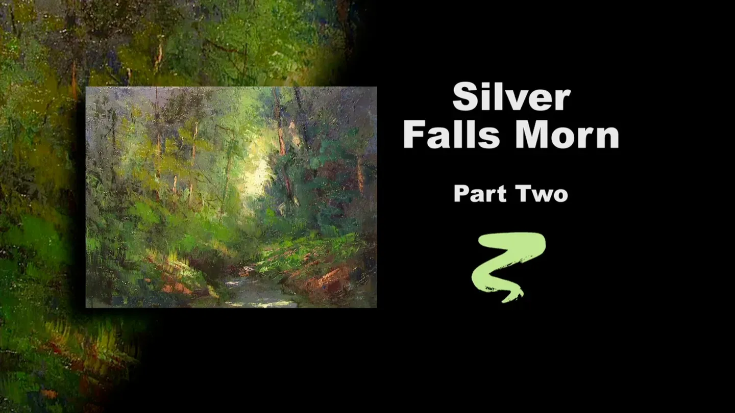
Silver Falls Morn Part II
3/1/2025 | 26m 46sVideo has Closed Captions
Buck puts the final touches on Silver Falls Morn.
Buck uses a pochade as inspiration to put the final touches on Silver Falls Morn, adding highlights to the foliage.
Problems with Closed Captions? Closed Captioning Feedback
Problems with Closed Captions? Closed Captioning Feedback
Painting with Paulson is a local public television program presented by Prairie Public
Painting with Paulson
Silver Falls Morn Part II
3/1/2025 | 26m 46sVideo has Closed Captions
Buck uses a pochade as inspiration to put the final touches on Silver Falls Morn, adding highlights to the foliage.
Problems with Closed Captions? Closed Captioning Feedback
How to Watch Painting with Paulson
Painting with Paulson is available to stream on pbs.org and the free PBS App, available on iPhone, Apple TV, Android TV, Android smartphones, Amazon Fire TV, Amazon Fire Tablet, Roku, Samsung Smart TV, and Vizio.
Providing Support for PBS.org
Learn Moreabout PBS online sponsorshipLet me talk to you sports fans out there.
You may lose the score, but you never have to lose the game!
[piano plays in bright rhythm & tone] ♪ ♪ ♪ ♪ Batter up!
Let's win the game!
We'll start with the bunny brush, and we'll start with oil, and we'll start with putting it on.
Now that we've started, this is going to make a little preparation for a Saturday night bath.
Notice, as I put that on, I have no concern about evenness until I come this way.
Even when doing this, I go gently, because I want to make sure it's still wet when you put on the Alizarin.
I'm going to dip in the oil, just a little bit.
This is-- you're not Alizarin, you're Quinacridone Violet.
Oo, are you pretty!
I'll put a little bit there.
I'm going to push it around, but it's kind of fun just to do something a little different.
Ok, now I'll start spreading it around.
What this should do, what this will do, is it'll make it a little cooler in going over some of the greens and that.
Ok, now let's take the paper towel and spread it around.
I'm going to go a little in the middle, not much.
But I like what it does in the kind of in-between areas.
Not too dark, not too light.
[soft scraping] Last week you were over on the left, now you're on the right.
What I have on the left is the pochade that was done with inspiration, maybe from memory, after looking at the sea.
So we build it up, and we've come to this.
Now we don't have any finished painting, but we just decide what would make it a good, good complete painting.
Well, initially, you want a real strong center of interest.
We sort of have that, but we'll go a little stronger.
We'll come down to the palette, we'll take a little of this, you're yellow and white.
I'll put a little more white into it.
I think I'll push you over to the side, and come with just a little more white.
That had a little too much yellow in it.
This will be placed on with a knife.
See today, we're doing very early, we're putting the impact in first, and this is a strong spot that receives this.
That practically is enough right there, because you have kind of some of the previous color is still showing a little bit there.
You've made it a little more subdued by the Saturday night bath.
Ok, I'm going to kind of stay in that area, and what I will do is look on the trunk of the tree.
I have some, what are you?
I know what you are.
I love this color.
This is my Transparent Red Iron Oxide, and take a little yellow and white in it.
This will give me a nice feeling on the tree that's very close to the sun area.
Oo, maybe just a little too much?
No, that's ok. No, it wipes away nicely.
Ok, we'll come over to the right, some of the same color.
Actually, just a little more of the Red Oxide in it.
And we'll come down here, so we can see this.
This is another tree trunk, just being lit a little bit by the sun.
I'm kind of staying around in this area, yet I intend to come back and put little branches on.
So at the moment, we're sort of playing just a little bit with the sunlight.
This is still the Transparent Red Oxide.
[whispering] The Transparent Red Oxide, Iron Oxide.
"Are you whispering, Buck?"
Yes, I'm whispering, because I need to make sure what I'm saying is right.
I need to hear it said!
Oo, that's very pretty!
Ok, now you notice on these trees, they're into the forest, they have little lights hitting on them.
What will be especially nice if I can take some, let's see, let's come down to the palette.
Here's Permanent Green Light.
We have just a little bit of Paynes Gray with it.
That's equal parts of Paynes Gray and Permanent Green Light.
Just a little touch of white.
About 2 parts green, 2 parts Paynes Gray, 1 white.
And I'll come up with this, in this area.
Look at the large dark area, but now see when I kind of just kind of drag, just gently.
See that's not real thick, because it's in the shadow area.
And you always have to be concerned in a shadow area, the amount of textures you put on.
Let me give you an example.
I'm going to take chunk of this green, real heavy chunk.
It's got a lot of texture.
See, if I'm over here in the shadows, with all the light it picks up, you wouldn't feel like there's depth of shadows.
So that's the reason, you watch, where you say, you "load the lights."
Put a lot of paint on the light areas and transparent shadows.
You'll hear those terms.
That's why they say it, and that's what they mean.
Ok, coming back more with this purple, green, and white.
We'll come down just a little bit.
As I'm placing this on, I'm dragging just slightly, a tap-drag.
New term-- "tap-drag."
And if I have a mistake, let's say that this is a mistake.
So I'll take some Paynes Gray and a little purple and a little green, and I'll just come back on top.
Use it almost like an eraser.
See how I push it down a little bit?
What I've done by pushing it down, it's not as bright, but it still has another secondary value of the greens, which is very pleasing.
Don't mind coming across some of those trees and hitting them just a little bit.
You can kind of disguise if you make too much of smear, but you want the green to come across.
Now, up above, and this is to the right of our smash of light.
I'm taking some of that same green that we had: the purple, and the Permanent Green Light, and the white.
This is what we have right there.
Now, I'll take just a little bit and kind of walk it out.
"Walk it out" means go very gently.
So see then you have a little loose foliage hanging out into the center of the painting.
Not much there, but a little bit there.
We'll come from the other side, same way, same color, same knife, coming from here.
I'll come down lower, however.
Oo, that is so great.
You want to be aware of what kind of trees you're painting.
These are fur trees, evergreen trees, Christmas trees, all that genre.
So that's why we can get the foliage going that way.
Now over to the left, we'll go lighter.
I have some more, let's see, this is the Permanent Green Light, and yellow and white.
How--might be a little too light.
That's better.
What did you put in there?
This is called "Azo Green."
I ran clear across the boarder, got Azo Green.
Is mixed in with yellow, white, and Permanent Green Light.
And we'll come over on this side.
And again, that same type stroke.
Just kind of pulling it down.
It just melts off the knife into the canvas.
It's just really a symphony in greens, in my opinion.
Gee, that's pretty!
I want to bring some of that, same color, same spot, into some of the green that I've put on there.
I like that, but the accent's a little generous.
So this'll soften that ever so slightly.
What about up here?
Just a little bit there, too; that's close to the sun.
So generally the closer it is to the light area, you have it more just suddenly done.
I'll take a touch of yellow and white.
♪ De-del-le-de-de.
♪ Come back up here and push into that guy, so he's not quite as strong.
Let's leave that area and we'll come down to the next area.
Gee, I love the textures that are there previously.
Oh my goodness.
Since we do 13 shows we say, "Previously on 13..." Come up here.
These are all just incidental darks.
You're working them, when I say "darks," they're actually lighter than what they're going near.
So you see them as a little detail, but they don't compete with this over here.
Ok, we'll put a little bit more down in here.
You're just disguising that dark area, reducing its size just a little bit.
That's again, too much, so we'll come down.
This is the purple and the Permanent Green Light, and we'll just push into this, which will make it less light.
But you make use of what's there.
See, you haven't destroyed it, you haven't erased it.
Now the area here, that area, I really like.
I'm going to take, let's see, let's put some Yellow Ochre, no, let's go ahead with just what we have here.
This is Cad Yellow and a little of the Hazel Green.
And I want this on.
When I put this on, I kind of push the brush against the canvas, and just push it up a little bit like that, and then you get little grass, growing grass.
And we have some over on the next ledge.
I'll come back to the first one, come just a little lower, so it's not just an isolated Mohawk.
Ok, on the other side, across the bank, we're kind of jumping back and forth, we'll take some of our green, this is green and white, Permanent Green Light and white, a little touch of yellow in it.
I think I'll bring out just a little bit more of yellow.
I run fast, I don't know if you're on a closeup or have got a broad screen.
I hope I don't confuse you too much.
Ok, this is yellow and the green.
And I sure appreciate you guys watching, and I appreciate the letters that you send.
I receive letters and phone calls from all over the country, Canada, West Africa, and so on; wanting to know a little bit more about this.
I know the one in Africa said, "Gosh Buck, I love your pochade series.
Could you send me a DVD or something."
Oh, gee, it's so nice when people like what you're doing.
And this is kind of returning to the pochades, isn't it?
Because we did series 600 and 700, were we took a pochade and made a complete painting out of it.
This time we had one that was done halfway, but boy, that's really stepping out there, and I love that!
Now we're trying to show a little bit where if you finished a painting, and yet you want to go a little further with it.
I think that's what we've shown a lot on this series, with our oceans and landscapes.
Now see this, I like this idea.
When I look at the pochade, I don't see it that bright there, but I'm going to come back with some yellow and white, and just maybe a touch of green.
And see, when I do this now, you say, well, there's the light.
And it just can touch just a little bit along the path coming down to the foreground.
I notice over here, on the left side, it has stronger light.
So again, when you do that, almost a triangular shape.
You have the light, then you have the two bases, and that's quite helpful.
If you have one more, we'd have a baseball field!
I love sports!
I love baseball.
My favorite team, [mumbles] see, I told you my favorite team.
I don't want to offend anybody.
My favorite team is who I want to win that particular day.
They may lose the score, but they don't lose the game, because they go away as good sports, being grateful that they could play.
"Oh, that's what he meant."
That's what he meant.
Yes.
Ok, I like that spot, but it's a little strong, so I'm going to take the purple and green and just touch just a little bit.
Just kind of angle it, so it's not quite as important.
Now over on the, this is really a combination of a cliff or a bank and some rocks.
So we're going to put a little bit on that.
And I have that same Transparent Red Iron Oxide.
That is such a great color.
Very close to burnt sienna, but just a little more power.
Skip across over here.
Beautiful.
Beautiful.
Ok, I was just looking, see, I still plan to still put on a few branches and that, but what I'm looking at now, ok, we have this light.
We have this light.
We could go a little stronger in the water.
See, we have a little stream that is not really emphasized.
It's there, but you have to discover it.
This is yellow and white, the same thing as we have up above.
There, a little bit across here, maybe just a touch in there.
You kind of follow this, maybe just a little bit back there.
If it's too strong, and I think maybe this one is, I'll take some of my purple and Paynes Gray.
Just diminish that slightly.
Ok, now we'll go with a small brush.
I don't think you, you haven't done much work this trip.
Must have been a frequent flyer carry-on, because you didn't get the seat.
Let's take, and we'll oil this up.
You can see I've been putting a lot of oil in that.
Let's take some of, let's see, what should we do?
This is Burnt Umber and you're the Red Oxide.
Ok, now where I start, just a little bit in here.
When I do this, I'm looking at kind of coming down towards areas where I already have a little foliage, so this kind of connects to them.
See, I feel one there, so we'll go ahead and put one in there.
Just sneak out, just a teeny little bit.
They have to be quite soft when they're into the area where the sun is, because there'd be quite a burn on that.
What I might do, well, I'll put a few more of these on, and then we'll talk about other things.
Let's have some just go down the other way a little bit too.
And when you go through your wet paint, often it will just dissolve in, so we might have to reload.
And here, notice how I just skipped a little bit, so you feel like the foliage is over the branch.
Very wiggly, small little ones.
I don't know if I want to do it or not, but we'll do it.
Sometimes, I'll take a palette knife, and it just has the smallest, you can hardly see that, you can't tell I got paint on there.
and just kind of a little loose one.
It's especially helpful using the knife, when you're going through a lot of wet paint.
Let's take some more of this, the Red Oxide and the umber, and what I want to do here, besides some branches, is just strengthen a little bit the far side of the trunk.
Not too much here, but a little bit there too, because I really don't see that trunk much.
It's been truncated!
Ok, further on the left side, on this one.
Sometimes you need to watch the top too.
Have little just going off there, there, there, there, and this trunk.
And I think, yes, over in the far side we'll go with some purple and Paynes Gray, not much, we'll just take a little bit and come down here.
A little bit of a suggestion of a branch coming too.
And here and there, inside.
When I say "inside," it's between some of the front trees.
You're seeing some of the distant ones.
Ok, let's look at the other side.
I'll stay a little bit with that black, Paynes Gray rather, and purple, and we'll strengthen this one.
Always thinking again, that there's foliage over the tree.
Therefore, I won't come down completely through the foliage that we've already placed on.
Here would have a great place to have a dark, for a couple of reasons-- one, to show the continuation, then as you come down lower, you have a little light showing between on both sides of the tree.
Let's have just a little branch coming up this way.
A little strong.
One up here.
These are things that add so much to it.
It takes just a little time to do it, but we'll kind of leave that now.
Let's just kind of look at several areas.
I think down here, this green, although I like it, it's a little strong, because it's being shaded by this foliage.
So we'll take a little bit of the Permanent Green Light and the purple, and I'll just touch this to knock it down just slightly.
Now, I feel, that in doing this, that rather than take a bunny brush and smooth it all out, I like the idea where we kind of tapped in a little extra paint were we needed to change the value or something.
Then, if I kind of tap like this as being my-- oops, I thought I was in California for a minute... at home!
See how it kind of blends in?
Particularly right there, that's a good example of that happening.
Now let's see about right in here.
Let's have just a little yellow and white, and kind of soft green on the knife.
Just pushing this around.
This is meant to be a little bland, also just a little subtle changes in value from one to the next.
I know, right in here I need a little green.
Right in there.
This has been so much fun.
I just tell you, it's so neat because I feel like I'm discovering with you.
When I don't have a finished painting to look at, you know very well, a lot of these things are going to be just serendipitous.
We'll discover as we go.
And are there mistakes?
Absolutely.
But you just correct them, if you know what the mistakes are.
Basically, I have a composition where I have my lightest light meeting my dark.
That's there.
It's a little off center.
You have a path of light that comes down, and you have values over on each side that aren't competing.
There not quite as light as that in the middle.
Therefore, you're really set, all you do is add some variety of colors that you like.
You might like even to have a little pink.
Let's just try a little bit of this.
Oo, you're red, you're Quinacridone Rose.
It just made me think of that.
What if we put a little red along here?
Hadn't planned to do that, but it certainly is a nice bridge between the bank and this.
And it almost looks like you have some of that red felt on the trees, and we'll make sure it's further felt.
Just a little too much.
This is so good.
This is so neat!
This one, this is a keeper.
This is a keeper.
I hope you enjoy it.
I hope you, as some of you have already done, that you will take pictures of your paintings, that you do from my shows, and let me look at them.
Boy, I painted once, a sack of peaches on a table, some peaches on the front.
Taught it to a workshop.
The gal sent me a Christmas card.
She had added a lit candle, and it was beautiful!
So you take these things and you run a little bit further.
And you might use different colors.
Maybe you want a fall scene.
It's not that hard to change.
Oh, that looks just right.
Ok, one, just I'll take just a little white.
Very seldom can I take pure white, but when there's a lot of paint there, it will kind of mix in.
So we're taking pure white and just touching both quantity and a little more purely.
I hope it's been a great visit for you, it's sure been good for me.
I've enjoyed every aspect of it, and you come away a winner, because you've tried, because you've tried.
I congratulate you for watching.
I congratulate you for trying.
And if you can go higher, do it.
We're all together on the same team.
Bye-bye!
♪ ♪ ♪ ♪ ♪ ♪ ♪ ♪ (woman) Funding for "Painting With Paulson" is made possible by...


Support for PBS provided by:
Painting with Paulson is a local public television program presented by Prairie Public